Overview
One place for your brand colors, fonts, text styles, buttons and spacing.
On this page
The Design System holds the styles your whole site shares: brand colors, heading and body fonts, text styles from display headings to small print, the default button, spacing sizes and the layout grid. Elements use these styles by reference, so when you change a color or a font here, every page and template that uses it changes with it.
Where to edit it
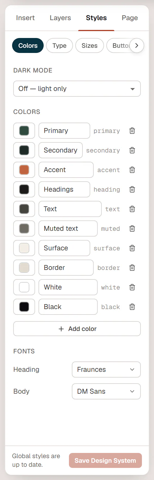
You edit the Design System in the editor, where every change previews live on the page:
- Open any page with Urmi.
- Click Styles in the left panel (or choose Styles (Design System) from the Urmi menu).
- Make your changes. The canvas updates as you go.
- Click Save Design System at the bottom of the panel.
Until you save, the panel says Changes apply to every page when saved. After saving, it says Global styles are up to date. Saving the page with Update or Publish also saves pending Design System changes.
Design System changes are not part of the page's undo history. If you change your mind before saving, reload the editor and leave without saving.
What is in it
The Styles tab has six tabs:
| Tab | What you set there |
|---|---|
| Colors | Brand colors, dark mode, and the heading and body fonts. See Colors, Dark mode and Fonts & text styles. |
| Type | Text styles: Display, H1–H6, Lead paragraph, Body, Small, Eyebrow, Button and your own. See Fonts & text styles. |
| Sizes | Named spacing, size and radius values you can use in any field. See Sizes & layout. |
| Buttons | The default look of buttons: typography, colors, padding, radius, border, shadow and hover effect. See Buttons. |
| Layout | Container width, side gutter, default gap and section spacing. See Sizes & layout. |
| Theme | Whether the styles apply to the whole site, body and link colors, and site behaviour such as smooth scrolling, page transitions, preloader and the lightbox. See Lightbox & site behaviour. |
Classes you create in the editor are stored in the Design System too.
The Design System screen in the admin
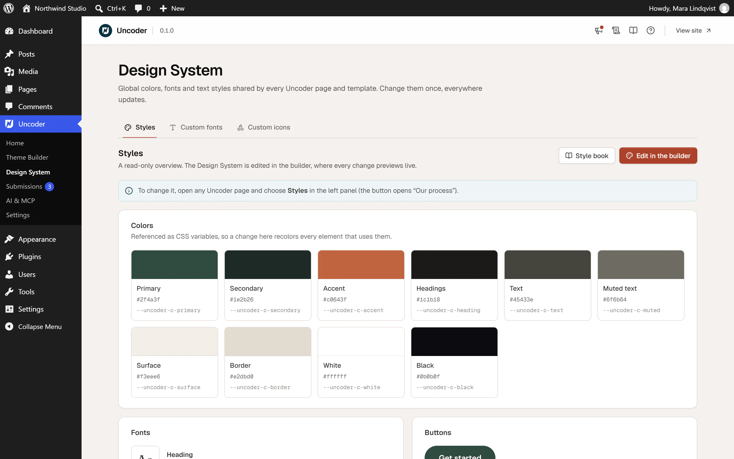
Urmi → Design System has three tabs:
- Styles: a read-only overview of your colors, fonts, buttons and text styles. Click a color to copy its CSS variable. Style book opens a page with every widget in your styles, and Edit in the builder opens your most recently edited page with the Styles tab.
- Custom fonts: upload your own font files and connect Adobe Fonts. See Custom fonts and Adobe Fonts.
- Custom icons: upload icon sets. See Custom icons.
How elements use the Design System
- In a color picker, colors from your Design System are listed under Site colors. A field using a site color shows its name and a globe icon. Change the color in the Design System, and the field follows.
- In a typography editor, the tiles at the top are your text styles. Pick one, and the element follows that style.
- In size and spacing fields, the { } button lets you pick a named size.
- Buttons without their own colors use the Design System button style.
A value typed straight into a field, such as #2f4a3f, does not follow the Design System. Use the site colors and text styles whenever you can, so a later rebrand takes one change.
A starter site or a site kit can set up the colors and fonts for you. You can then fine-tune them here.
Who can change it
Changing the Design System needs a role that can edit the theme (administrators, by default). Other users who can design pages, such as authors, see the Styles tab view-only, with the notice View only. Ask an administrator to change the Design System. Users with content-only access do not see the tab at all. See Roles & access.