Posts
A grid, list or cards of posts with image, title, meta data, excerpt and a read more link.
On this page
The Posts widget lists posts with a ready-made card: featured image, title, meta data (such as date and reading time), an excerpt and a Read more link. You choose which parts to show and style them, without designing a card yourself. Use it for a blog page, "latest articles" on the home page, or an archive template.
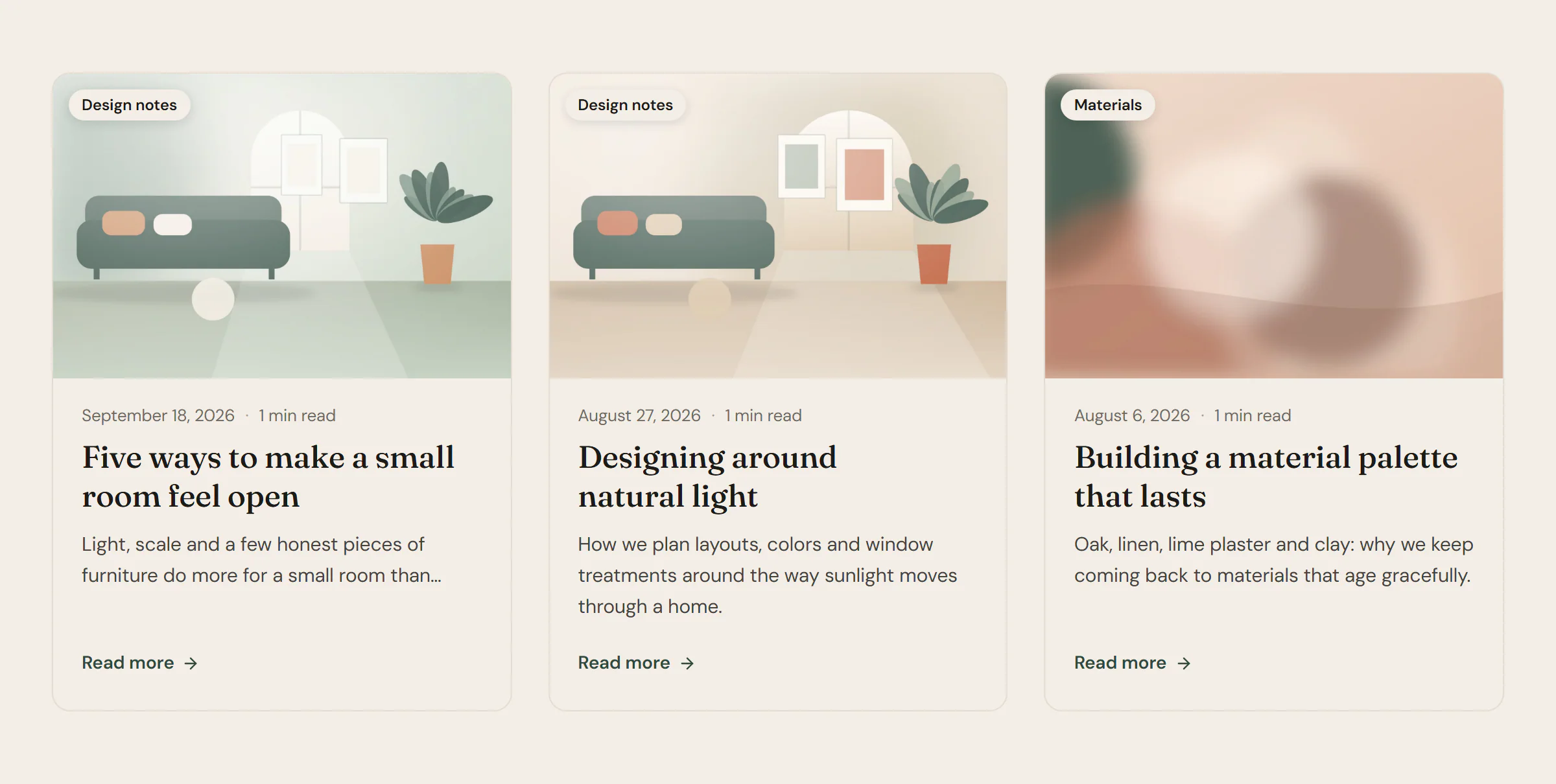
Add Posts
Open Insert in the left panel and find Posts in the Content group, or type "posts" in the search box. Drag it onto the canvas, or click it to add it next to the selected element. See Add elements.
By default it shows the six latest posts as cards. Change this under Query and Layout.
Choose which posts to show
Pick a Source in the Query section:
- Custom query: choose the Post type, how many Items, the order, and optionally which items, terms or authors to include or exclude.
- Current query (archives): the posts of the page being viewed. Use it in archive and search results templates. In the editor, the latest posts are shown as a preview.
- Related to current post: posts that share a category with the post being viewed.
- Manual selection: exactly the posts you pick in Include, in that order.
Choose the card content
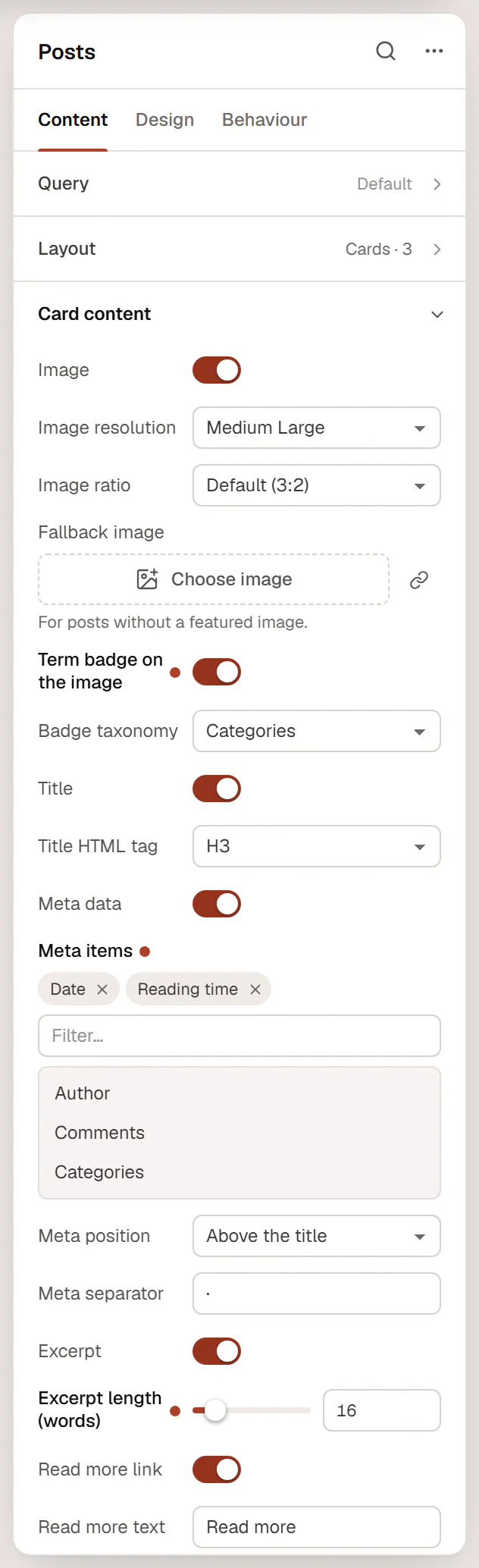
Turn each part on or off under Card content. Meta items can show the Author, Date, Comments, Categories and Reading time (estimated from the length of the post). Add a Fallback image for posts without a featured image, so every card keeps the same shape.
Content tab settings
| Setting | What it does |
|---|---|
| Query | Which posts to show: Source, Post type, Items (6 by default), Offset, Order by, Order, Include, Exclude, Terms (taxonomy:id), Authors, Ignore sticky posts, Exclude current post and Avoid duplicates (skips posts an earlier Posts widget on the page already shows). See Loop Grid for each option. |
| Nothing found message | Shown when there are no posts. |
| Setting | What it does |
|---|---|
| Layout | Grid, Cards or List (image beside text). Default: Cards. |
| Columns | Number of columns (1–6). Empty fits as many columns as the space allows. Can differ per device. |
| Whole card is clickable | Extends the title link over the whole card. |
| Setting | What it does |
|---|---|
| Image | Shows the featured image. On by default. |
| Image resolution | Thumbnail, Medium, Medium Large, Large, 1536x1536, 2048x2048 or Full. Default: Medium Large. |
| Image ratio | Default (3:2), 1:1, 4:3, 3:2, 16:9, 3:4, 4:5 or Original. Can differ per device. |
| Fallback image | Shown for posts without a featured image. |
| Term badge on the image | Shows the first category (or tag) on the image. |
| Badge taxonomy | Categories or Tags. Default: Categories. Shown when the badge is on. |
| Title | Shows the post title. On by default. |
| Title HTML tag | H1 to H6, DIV, SPAN or P. Default: H3. |
| Meta data | Shows the meta line. On by default. |
| Meta items | Any of Author, Date, Comments, Categories and Reading time. Default: Date, Author. |
| Meta position | Above the title or Below the title. Default: Above the title. |
| Meta separator | The character between meta items. Default: ·. |
| Excerpt | Shows the excerpt, or the start of the post when it has none. On by default. |
| Excerpt length (words) | 1–120. Default: 20. |
| Read more link | Shows the link. On by default. |
| Read more text | Default: Read more. |
| Read more icon | Default: an arrow. |
| Setting | What it does |
|---|---|
| Pagination | None, Numbers, Previous / next or Numbers with previous / next. Default: None. |
| Previous text, Next text | The link labels. Shown for the previous / next types. |
| Alignment | Start, Center or End. Can differ per device. |
Design tab settings
| Section | Settings |
|---|---|
| Layout | Column gap, Row gap, Image width (list) (List layout), Hover effect (None, Zoom image, Lift card or Lift card and zoom image; Zoom image by default). |
| Card | Background, Border and Shadow (Normal tab), Border color and Shadow (Hover tab), Border radius, Content padding, Text alignment. |
| Image | Border radius, Spacing, CSS filters. |
| Badge | Typography, Text color, Background, Border radius. |
| Title | Typography, Color, Hover color, Spacing. |
| Meta data | Typography, Color, Spacing. |
| Excerpt | Typography, Color, Spacing. |
| Read more | Typography, Color, Hover color. |
| Pagination | Typography, Text color and Background (with Normal, Hover and Active tabs), Border radius, Distance from posts, Space between. |
| Nothing found message | Typography, Color. |
Each section only appears when its part is turned on. The Design tab also has the sections every element shares: Spacing & position, Background & border and Mask. See Spacing, size & position.
Behaviour tab
The Behaviour tab has the settings every element shares. Set an Anchor ID in Anchor & classes when a page has several post lists and a Loop Filter must target one of them.
Tips
- Need a card with your own layout, such as a price or a custom field? Use the Loop Grid with a Loop item template instead.
- Add a Loop Filter above the widget to let visitors filter by category or search without reloading the page.