Table of Contents
A table of contents built from the headings on the page, with smooth scrolling and the current section highlighted.
On this page
The Table of Contents widget lists the headings of a page as links, so readers can see what a long article covers and jump to a section. It builds itself from the headings on the page, scrolls smoothly to them and highlights the section being read. You can make it collapsible or keep it in view while the reader scrolls.
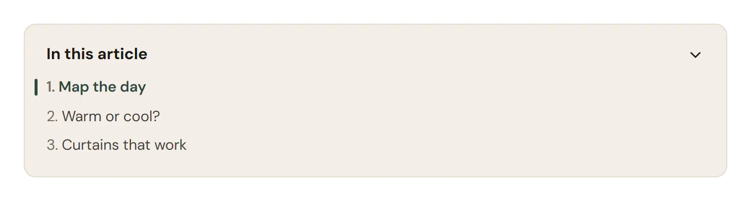
Add a Table of Contents
Open Insert in the left panel and find Table of Contents in the Content group, or type "contents" in the search box. Drag it onto the canvas, or click it to add it next to the selected element. See Add elements.
For a blog, add it once to your single post template, above or beside the Post Content widget. Every post then gets its own list.
Choose which headings to list
- Headings to include picks the levels, H2 and H3 by default. With Nest sub-headings on, H3s are indented under their H2.
- The widget scans the page, or the template, it is placed in. To list only the article's headings, type a Container selector, such as
.urmi-post-contentfor the Post Content widget. - To leave out some headings, type an Exclude selector. Headings inside elements that match it are skipped. For example, give a section the class
no-tocin Behaviour → Anchor & classes and type.no-toc. - Minimum headings hides the whole box on pages with fewer headings, such as a short post.
Headings without an anchor get one automatically, so every link works.
Keep it in view
Turn on Sticky so the box stays visible while the reader scrolls its column. This works best in a two-column layout with the table of contents in a narrow side column. If your header is sticky too, set Sticky distance from top and Scroll offset (px) to its height, so headings do not end up behind it.
Content tab settings
| Setting | What it does |
|---|---|
| Title | The box title. Default: Table of contents. |
| Title HTML tag | H1 to H6, DIV, SPAN or P. Default: P, so the title does not appear in the list or the page outline. |
| Headings to include | Any of H1 to H6. Default: H2, H3. |
| Container selector | The CSS selector of the area to scan. Empty scans the whole page or template the widget is in. |
| Exclude selector | Headings inside elements matching this selector are skipped. |
| Marker | Numbers (1.1, 1.2…), Bullets or None. Default: Numbers. |
| Nest sub-headings | Indents lower levels under their parent heading. On by default. |
| Minimum headings | The box hides itself when the page has fewer headings (1–20). Default: 2. |
| Setting | What it does |
|---|---|
| Collapsible | Adds an arrow that opens and closes the list. |
| Start collapsed | The list starts closed. Shown when Collapsible is on. |
| Smooth scroll | Scrolls smoothly to a heading. On by default. |
| Scroll offset (px) | Space kept above the heading, such as the height of a sticky header (0–400). Default: 24. |
| Highlight the current section | Marks the link of the section being read. On by default. |
| Sticky | Keeps the box in view while its column scrolls. |
| Sticky distance from top | The gap above the box while it sticks. Shown when Sticky is on. |
Design tab settings
| Section | Settings |
|---|---|
| Box | Background, Border, Border radius, Padding, Shadow, List max height (longer lists scroll inside the box). |
| Title | Typography, Color, Divider color, Spacing. |
| List | Typography, Color and Marker color (Normal tab), Color (Hover tab), Color and Indicator color of the current section (Active tab), Space between items, Sub-level indent, Collapse icon color (when collapsible). |
The Design tab also has the sections every element shares: Spacing & position, Background & border and Mask. See Spacing, size & position.
Behaviour tab
The Behaviour tab has the settings every element shares: anchor and classes, entrance animations, motion effects, visibility per device, display conditions and interactions. See Visibility.
Tips
- The list follows your heading structure. Use headings in order (H2, then H3) in your posts for a clean, nested table of contents.
- In the editor, the list shows the headings it finds on the canvas, or sample entries while there are none.