Post Navigation
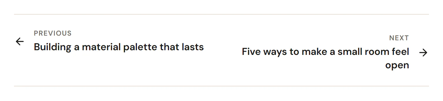
Links to the previous and next post, with labels, titles and arrows.
On this page
The Post Navigation widget adds "Previous" and "Next" links at the end of a post, so readers can move on to the next article without going back to the blog page. Each link shows a label, the post title and an arrow.
Where the links come from
The links point to the posts published just before and just after the one being viewed, by date and within the same post type. Turn on Stay in the same term to link only to posts in the same category (or tag). On the newest post there is no "Next" link, and on the oldest there is no "Previous" link.
In the editor, the links are based on the post chosen in Preview with on the Template tab of the left panel.
Add Post Navigation
Open your blog post template in the Theme Builder. Then open Insert in the left panel, find Post Navigation in the Site & theme group (or type "next" or "previous" in the search box) and drag it to the end of the post. See Add elements.
Content tab settings
| Setting | What it does |
|---|---|
| Labels | Shows the "Previous" and "Next" labels. On by default. |
| Previous label | Default: Previous. Shown when Labels is on. |
| Next label | Default: Next. Shown when Labels is on. |
| Post titles | Shows the titles of the linked posts. On by default. |
| Arrows | Shows arrow icons. On by default. |
| Previous icon, Next icon | The arrow icons. Shown when Arrows is on. |
| Stay in the same term | Only links to posts in the same category or tag. |
| Taxonomy | Categories or Tags (and other taxonomies of your site). Default: Categories. Shown when Stay in the same term is on. |
Design tab settings
| Section | Settings |
|---|---|
| Layout | Space between, Divider color (the lines above and below), Padding. |
| Label | Typography, Color. Shown when Labels is on. |
| Title | Typography, Color, Hover color. Shown when Post titles is on. |
| Arrows | Size, Color, Hover color, Spacing. Shown when Arrows is on. |
The Design tab also has the sections every element shares: Spacing & position, Background & border and Mask. See Spacing, size & position.
Behaviour tab
The Behaviour tab has the settings every element shares: anchor and classes, entrance animations, motion effects, visibility per device, display conditions and interactions. See Visibility.
Tips
- For a richer "read next" section with images, add a Loop Carousel with the source Related to current post instead, or as well.