Call to Action
A promo box with an image, a short message and up to two buttons.
On this page
The Call to Action widget is a complete promo box in one element: an image, a small eyebrow line, a title, a sentence of text and up to two buttons. Use it to invite visitors to the next step, such as booking a call or seeing your prices.
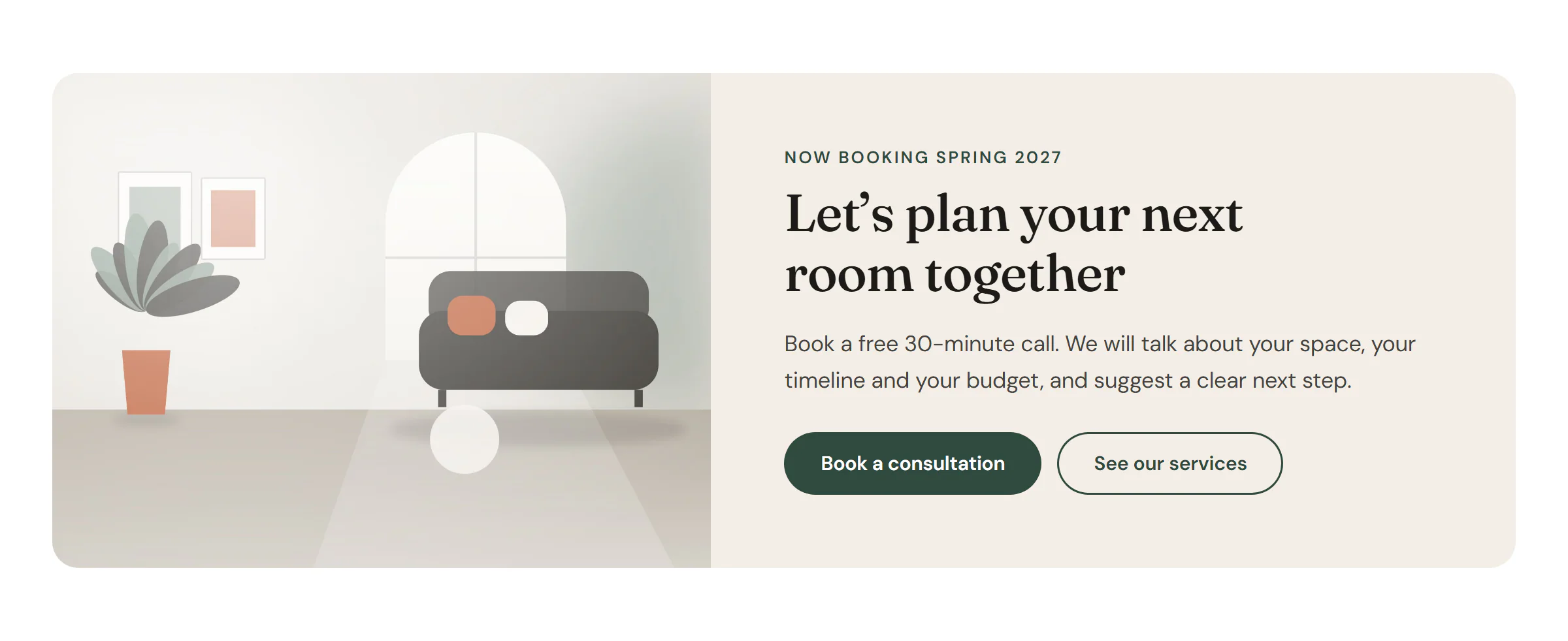
Add a Call to Action
Open Insert in the left panel and find Call to Action in the Marketing group, or type "call" in the search box. Drag it onto the canvas, or click it to add it next to the selected element. See Add elements.
Then fill in the texts under Content and set the buttons' links. Both buttons use your Design System button styles, so they match the rest of the site. See Buttons.
Choose a layout
- Classic (image beside content) puts the image next to the text. Choose the side with Image position (Left, Right, Top or Bottom). When the box gets too narrow, the image moves above the text by itself. To force this on phones, switch to the mobile view and set Image position to Top.
- Cover (image as background) fills the whole box with the image and puts the text on top, behind a see-through overlay. This works well for wide banners. Adjust the overlay in Design → Overlay until the text is easy to read.
You can also leave Image empty for a text-only box.
Content tab settings
| Setting | What it does |
|---|---|
| Layout | Classic (image beside content) or Cover (image as background). Default: Classic. |
| Image | The picture from your media library. Optional. Supports dynamic data, for example the featured image in a template. |
| Resolution | Which image size WordPress sends: Medium, Medium large, Large or Full. Default: Large. Shown when an image is set. |
| Image position | Left, Right, Top or Bottom. Default: Left. Can differ per device. Shown for the Classic layout. |
| Setting | What it does |
|---|---|
| Eyebrow | A short line above the title, such as "Limited offer". Leave it empty to hide it. Supports dynamic data. |
| Title | The main message. Supports dynamic data. |
| Title HTML tag | H1 to H6, DIV, SPAN or P. Default: H2. |
| Description | One or two sentences under the title. Leave it empty to hide it. Supports dynamic data. |
| Setting | What it does |
|---|---|
| Button text | The label of the main button. Leave it empty to hide the button. Supports dynamic data. |
| Button link | Where the button goes. Type an address or search for a page; the gear opens Open in new tab, Add nofollow and Custom attributes. |
| Button style | Primary, Secondary, Outline, Ghost or Text link, from your Design System. Default: Primary. |
| Button icon | An optional icon in the main button. |
| Second button | Adds a second button next to the first. Off by default. |
| Second button text | The label of the second button. Shown when Second button is on. |
| Second button link | Where the second button goes. Shown when Second button is on. |
| Second button style | The style of the second button. Default: Outline. Shown when Second button is on. |
| Button size | S, M, L or XL, for both buttons. Default: M. |
| Setting | What it does |
|---|---|
| Ribbon text | A small corner ribbon, such as "New". Leave it empty to hide the ribbon. |
| Ribbon position | Left or Right corner. Default: Right. Shown when there is ribbon text. |
Design tab settings
| Section | Settings |
|---|---|
| Box | Min height, Content alignment, Vertical position, Content max width, Content padding, Background, Text color, Border, Border radius, Shadow (with Normal and Hover tabs). |
| Image | Image width, Image min height and Gap to content (Classic layout), Focal point (which part of the image stays visible when it is cropped), Image radius, Hover effect (Zoom in, Zoom out or Grayscale to color; Zoom in by default), Zoom scale, Transition (ms), CSS filters. |
| Overlay | Overlay and Opacity (with Normal and Hover tabs), Blend mode. The overlay sits over the image in both layouts. |
| Eyebrow | Typography, Color, Spacing below. Shown when there is an eyebrow. |
| Title | Typography, Color, Color on box hover, Spacing below, Text shadow. |
| Description | Typography, Color, Spacing below. Shown when there is a description. |
| Buttons | Gap between buttons, Typography, Border radius, Padding. Main button and Second button: Text color, Background and Border color (with Normal and Hover tabs). |
| Ribbon | Background, Text color, Typography, Distance from corner, Shadow. Shown when there is ribbon text. |
The Design tab also has the sections every element shares: Spacing & position, Background & border and Mask. See Spacing, size & position.
Behaviour tab
The Behaviour tab has the settings every element shares: anchor and classes, entrance animations, motion effects, visibility per device, display conditions and interactions. See Motion & effects and Display conditions.
Tips
- Keep the title short: about eight words fit on two lines in most layouts.
- In the Cover layout, a gradient overlay that is darker at the bottom keeps a bright photo visible while the text stays readable.
- To use the same promo on many pages, save the widget, or the section around it, as a template and place it with the Template widget. Change it once and every page updates.