Alert
A notice for info, success, warning or danger, with an optional dismiss button.
On this page
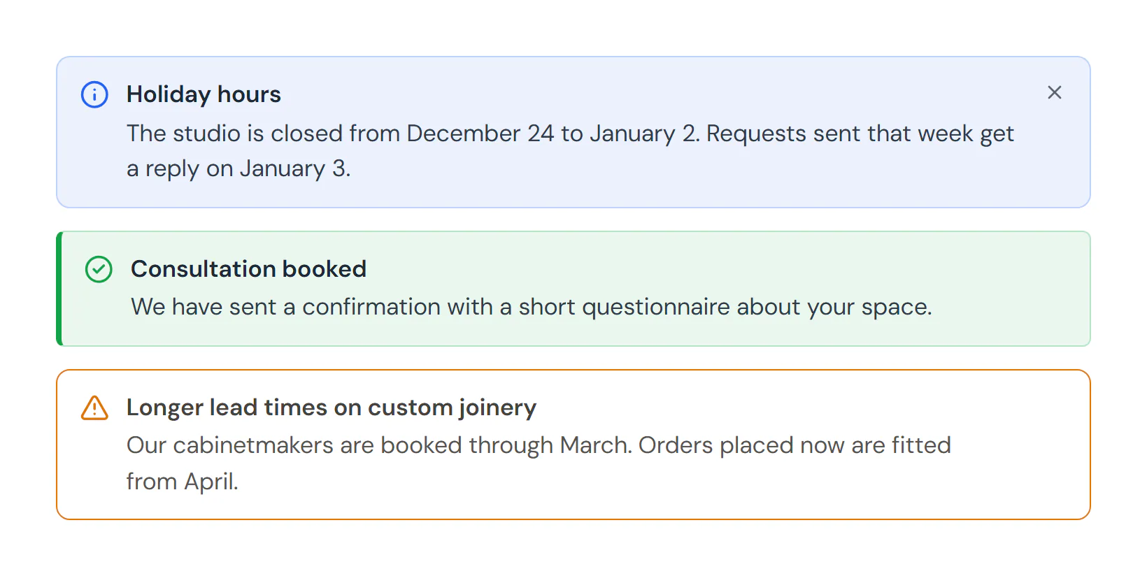
The Alert widget highlights a short message: holiday hours, a booking confirmation, a delivery delay or an important warning. Each type has its own icon and color, and visitors can close the alert. With Remember dismissal, it stays closed for them on later visits.
Add an alert
Insert it
Open Insert in the left panel, find Alert under Basic (or type
alertin Search widgets) and click it or drag it onto the canvas.Write the message
Type the Title and Description in Content → Alert, or double-click the text on the canvas to edit it there.
Choose the type and style
Pick a Type (Info, Success, Warning or Danger) and a Style. The type sets the icon and color; change the color with Design → Box → Accent color.
Decide how it closes
Keep Dismiss button on to let visitors close it. Turn on Remember dismissal to keep it closed for them.
Show a dismissed alert again
A remembered dismissal is stored in the visitor's browser under the Storage key. When the message changes, for example next year's holiday dates, type a new Storage key (such as holiday-notice-2027) and every visitor sees the alert again.
Settings
Settings marked Per device can differ on desktop, tablet and mobile (see Responsive editing). Fields that support dynamic tags can show data such as the post title (see Dynamic tags).
Content tab
| Setting | What it does |
|---|---|
| Type | The kind of message. It sets the default icon and color. Options: Info, Success, Warning, Danger. Default: Info. |
| Style | The look: a tinted box, a tinted box with a colored side line, an outline, or a solid colored box. Options: Soft, Soft with side accent, Outline, Solid. Default: Soft. |
| Title | The bold first line. Leave it empty for a one-line alert. Supports dynamic tags. |
| Description | The message under the title. Bold, italic and links are allowed. Supports dynamic tags. |
| Show icon | Shows an icon at the start of the alert. On by default. |
| Icon | Replaces the icon of the alert type. Leave empty to keep it. Shown when Show icon is on. |
| Dismiss button | Adds a close button so visitors can hide the alert. On by default. |
| Remember dismissal | Keeps the alert hidden for this visitor after they close it (remembered in their browser). Shown when Dismiss button is on. |
| Storage key | A name for the remembered choice. Change it to show the alert again to everyone, for example when the message changes. Defaults to the element ID. Shown when Dismiss button is on and Remember dismissal is on. |
Design tab
| Setting | What it does |
|---|---|
| Accent color | The main color of the alert: it drives the icon, the border and the tinted background. |
| Background color | Background color of the alert box, when it should differ from the tint. |
| Border | Border style, width and color of the box. |
| Side accent width | Width of the colored side line. Shown when Style is Soft with side accent. Per device. |
| Border radius | Rounds the corners of the box. Per device. |
| Padding | Space inside the box. Per device. |
| Shadow | Shadow of the box. |
This section shows when Show icon is on.
| Setting | What it does |
|---|---|
| Color | Color of the icon. |
| Size | Size of the icon. Per device. |
| Spacing | Space between the icon and the text. Per device. |
| Setting | What it does |
|---|---|
| Title typography | Text style (from the Design System) or font, size, weight, line height and spacing of the title. |
| Title color | Color of the title. |
| Title spacing | Space between the title and the description. Per device. |
| Description typography | Text style (from the Design System) or font, size, weight, line height and spacing of the description. |
| Description color | Color of the description. |
This section shows when Dismiss button is on.
| Setting | What it does |
|---|---|
| Size | Size of the dismiss button. Per device. |
| Normal › Color | Color of the dismiss button. |
| Hover › Color | Color of the dismiss button on hover. |
| Hover › Background | Background color of the dismiss button on hover. |
Every element also has these sections at the end of the Design tab.
| Section | What it does |
|---|---|
| Spacing & position | Margin, padding, width, alignment in its container, order, position (relative, absolute, fixed), offsets, z-index and global classes. See Spacing, size & position. |
| Background & border | Background, border, border radius, box shadow, overflow and opacity of the whole element. See Colors & backgrounds and Borders & shadows. |
| Mask | Crops the element to a shape (circle, arch, blob, star…) or your own SVG or PNG. See Shape dividers & masks. |
Behaviour tab
The Behaviour tab is the same for every element.
| Section | What it does |
|---|---|
| Anchor & classes | An Anchor ID for #links and your own CSS classes. |
| Animations | Entrance, scroll, hover and loop animations from presets or your own timeline. See Motion & effects. |
| Motion & effects | A simple entrance animation, transforms (also on hover), CSS and backdrop filters, and sticky positioning. |
| Scroll & mouse effects | Movement, rotation, scale, fade and blur while the page scrolls, and pointer effects (follow the pointer, 3D tilt). |
| Visibility | Hide the element on desktop, tablet or mobile, or in dark or light mode. See Visibility. |
| Conditions | Show the element only when rules match, such as logged-in visitors, a date range or a URL parameter. See Display conditions. |
| Interactions | Show, hide or change other elements when this one is clicked, hovered or scrolled into view. See Interactions. |
| Attributes | Custom HTML attributes for this element. See Anchor, classes & attributes. |
Tips
- Keep it short. A title of a few words and one or two sentences read best.
- Don't rely on color alone. The icon and the words should say what kind of message it is, for visitors who cannot tell the colors apart.
- Time-limited notices. Use Behaviour → Conditions with a date range to show an alert only during a period, such as the weeks before a holiday. See Display conditions.
- Site-wide banners. For a notice on every page, put the alert in your header template or use a bar popup.