Interactions
Make elements respond to clicks, hovers and scrolling without writing code.
Interactions make things happen on the live page when visitors click, hover or scroll: show a hidden panel, toggle a class, open a popup, scroll to a section. You set them up as simple sentences: When something happens, do an action on an element.
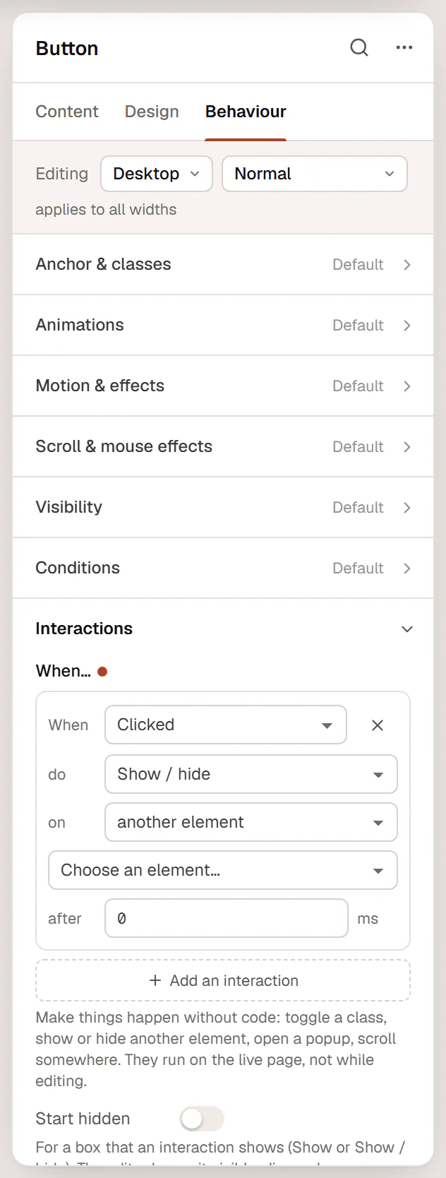
Add an interaction
Open Interactions
Select the element that visitors interact with, for example a button, and open Behaviour → Interactions.
Add a row
Click Add an interaction. A new row reads When Clicked, do Show / hide, on another element.
Choose the trigger
Pick what starts it in When.
Choose the action and the target
Pick what happens in do, and which element it happens to in on: this element, another element (choose it from the list of elements on the page) or a CSS selector.
Add a delay (optional)
Type a number of milliseconds in after … ms to wait before the action runs.
Add more rows for more interactions. Click × (Remove this interaction) to delete one. Interactions run on the live page, not while you edit: preview the page to test them.
Triggers
| Trigger | When it runs |
|---|---|
| Clicked | Visitors click or tap the element. It also works with the keyboard (Enter or Space). |
| Mouse enters / Mouse leaves | The pointer moves onto or off the element. |
| Scrolls into view / Scrolls out of view | The element appears on screen, or leaves it after being seen. |
| Page loads | The page has opened. |
| Page scrolled past… | The page has scrolled further than a number of pixels (by … px). When visitors scroll back up, the action is undone. |
Actions
| Action | What it does |
|---|---|
| Show / hide | Shows the target if it is hidden, hides it if it is visible. |
| Show / Hide | Shows or hides the target. |
| Toggle class / Add class / Remove class | Changes a CSS class on the target, for example is-open. Style the class with a custom selector such as &.is-open. |
| Set attribute / Remove attribute | Sets an HTML attribute on the target (name=value, for example aria-pressed=true) or removes it. |
| Open popup / Close popup | Opens a popup you built in the Theme Builder, or closes the popup the element is in. See Popups. |
| Scroll to | Scrolls smoothly to the target, stopping below a sticky header. |
Examples
A "Read more" button that reveals extra text
- Select the extra text (or its container) and turn on Start hidden in Behaviour → Interactions. In the editor it stays visible, dimmed, so you can still edit it.
- Select the button and add: When Clicked, do Show / hide, on another element → choose the extra text.
A header that changes after scrolling
- Select the header container and add: When Page scrolled past… by 80 px, do Add class, on this element, with the class
is-scrolled. - In the Design tab, choose Custom selector… in the state list, type
&.is-scrolled, and give that state a background color and a smaller padding.
When visitors scroll back to the top, the class is removed again.
For common cases there are ready-made settings: sticky and shrinking headers in Page settings, popups with triggers in Popups, and the Off-Canvas, Accordion and Tabs widgets.
Good to know
- Rows that are not complete (no element chosen, no class name, no popup) are dropped when you save. Check each row before you leave the editor.
- An element you click that is not a link or button becomes keyboard accessible automatically, and screen readers are told whether the target is expanded.
- For interactions that depend on who the visitor is (logged in, a date, a URL parameter), use display conditions instead: they decide on the server whether an element is on the page at all.