Lightbox & site behaviour
Smooth scrolling, back-to-top button, page transitions, preloader and the image lightbox.
The Theme tab of the Design System holds site-wide settings that are not about one element: whether your styles apply to the whole site, the base text and link colors, how the site scrolls and moves between pages, and how images open in the lightbox.
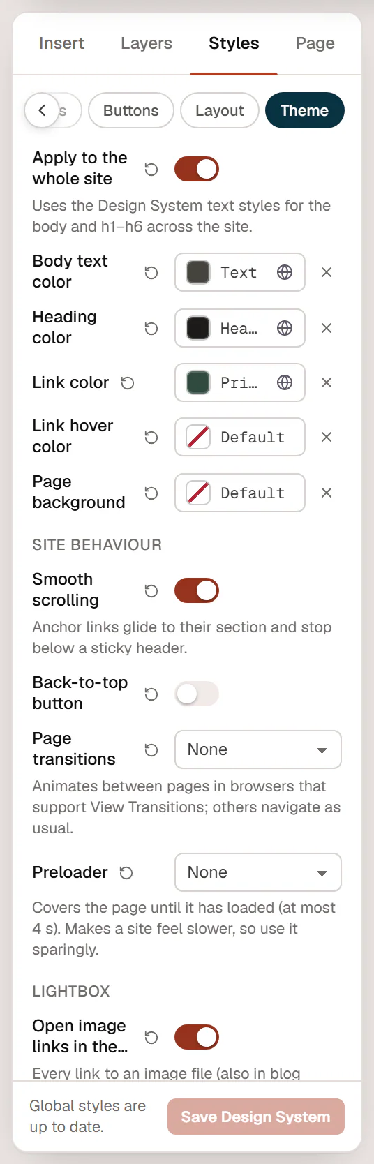
Open it in the editor with Styles in the left panel, then the Theme tab. Click Save Design System after your changes.
Apply the styles to the whole site
Apply to the whole site (on by default) uses your Design System for all text on the site, also on pages, posts and archives that are not built with Urmi:
- the page body gets the Body text style, the Body text color and the Page background;
- h1 to h6 headings get the Heading 1–Heading 6 text styles and the Heading color.
Turn it off if your theme should keep its own typography outside Urmi content. The same switch appears in Urmi → Settings → General as Load Urmi styles on every page.
Base colors
| Setting | What it does |
|---|---|
| Body text color | Color of normal text. Uses Text by default. |
| Heading color | Color of h1–h6 headings. Uses Headings by default. |
| Link color | Color of text links in Urmi content (not buttons). Uses Primary by default. |
| Link hover color | Color of text links on hover. Empty: no change. |
| Page background | Background color of the page. Empty: your theme's background. |
Site behaviour
| Setting | What it does | Default |
|---|---|---|
| Smooth scrolling | Links to a section on the same page (such as #contact) glide to it instead of jumping, and stop below a sticky header. | On |
| Back-to-top button | Shows a round button in the corner once visitors have scrolled down; it takes them back to the top. Choose the corner with Button side: Right or Left. | Off |
| Page transitions | Animates between pages: None, Cross-fade or Slide up. Works in browsers that support View Transitions; other browsers navigate as usual. | None |
| Preloader | Covers the page until it has loaded, for at most 4 seconds: None, Spinner, Loading bar or Pulsing logo (your site logo, or the site name). | None |
| Only on the first page of a visit | With a preloader: show it only once per visit, not on every page. | On |
All motion here respects visitors who prefer reduced motion: they get instant scrolling and no transitions or preloader animation. None of these effects run in the editor.
A preloader makes a site feel slower, because visitors wait for it even when the page is ready. Use it sparingly, for example on a portfolio home page with a large hero video.
Lightbox
The lightbox shows an image full screen when visitors click it, with arrows to browse through the other images of the same gallery or page.
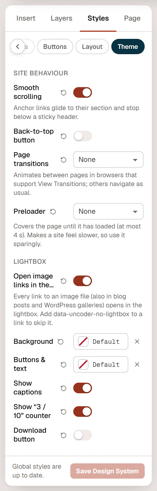
| Setting | What it does | Default |
|---|---|---|
| Open image links in the lightbox | Every link to an image file opens in the lightbox, also in blog posts and WordPress galleries. | On |
| Background | Color behind the image. | Near-black |
| Buttons & text | Color of the arrows, close button, caption and counter. | White |
| Show captions | Shows the image caption under the image. | On |
| Show “3 / 10” counter | Shows the position in the set when there are several images. | On |
| Download button | Adds a button to download the image. | Off |
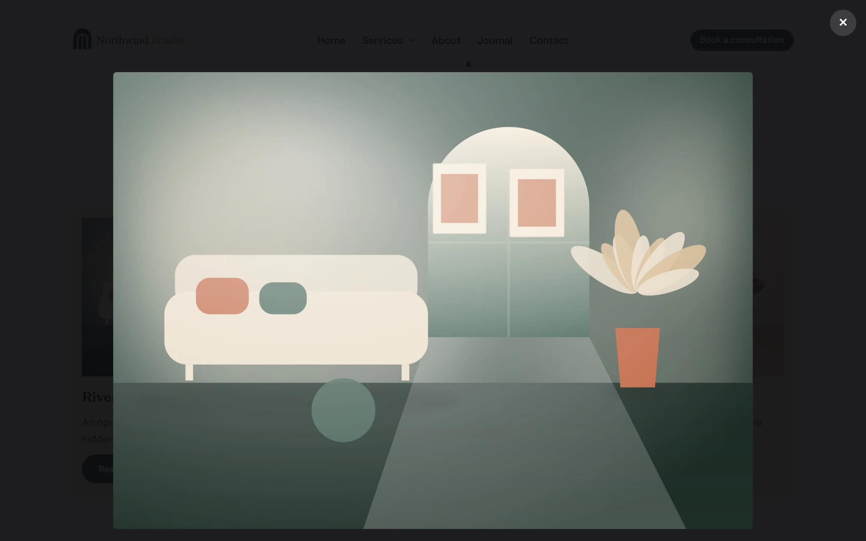
These settings also apply to widgets that have their own lightbox option, such as the Image Gallery and Image Carousel. Visitors can browse with the arrow keys or by swiping, and close the lightbox with Esc or by clicking outside the image.
To open an image in the lightbox, set its link to the image file: in the Image widget, set Link to Image file (lightbox). To keep one image link out of the lightbox, add the attribute data-urmi-no-lightbox to the link (see Anchor, classes & attributes).