Team Member
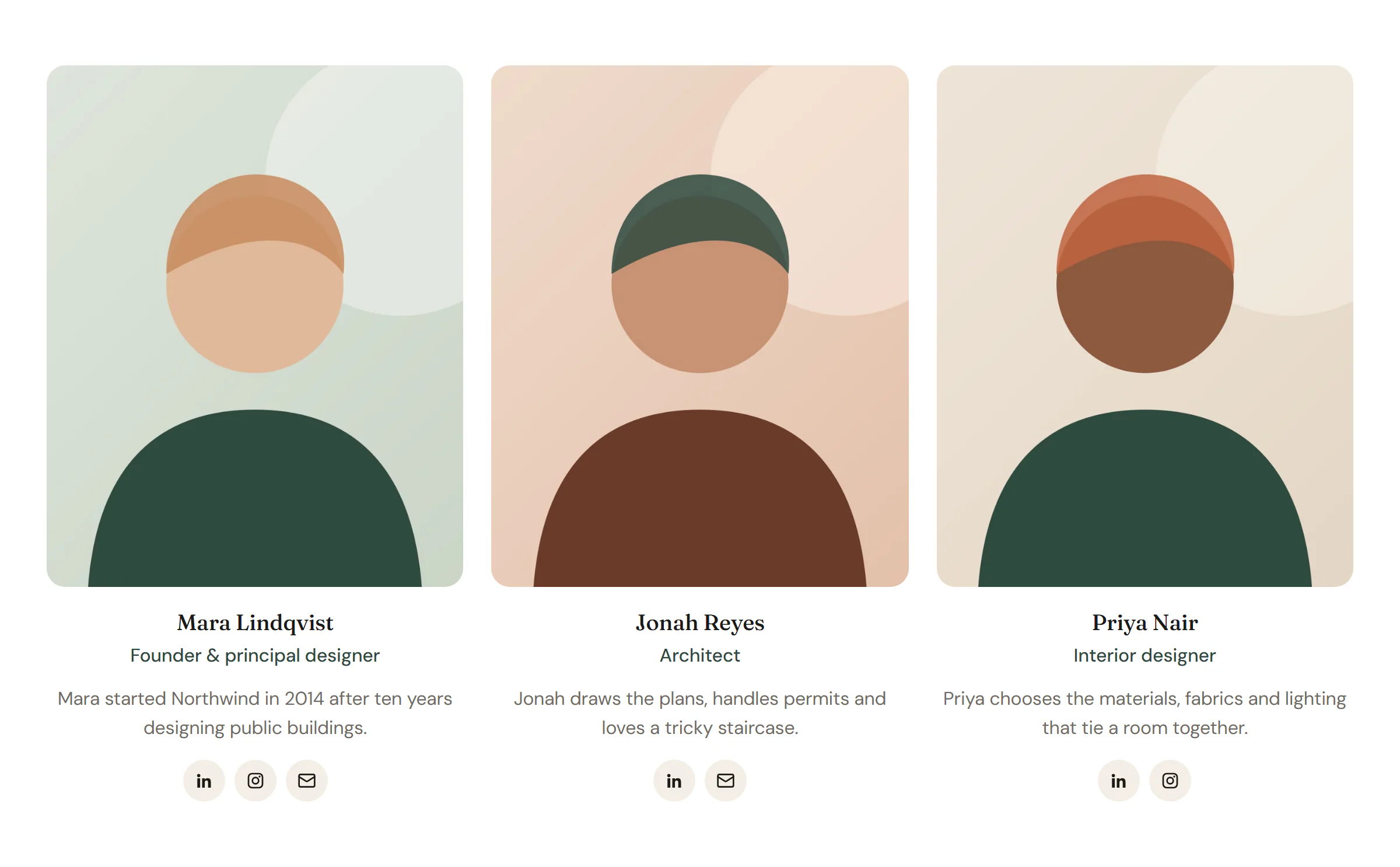
A person card with photo, name, role, short bio and social links.
On this page
The Team Member widget introduces one person: a photo, their name and role, a short bio and links to their profiles. Place several side by side for a team section on your About page.
Add a Team Member
Open Insert in the left panel and find Team Member in the Marketing group, or type "team" in the search box. Drag it onto the canvas, or click it to add it next to the selected element. See Add elements.
For a team section, put the cards in a grid container, fill in the first card, then duplicate it with Ctrl+D (⌘+D on a Mac). See Grid layouts.
Choose a layout
- Card (text below photo) stacks the photo, name, role, bio and links.
- Overlay (text on photo) puts the name and role on the photo. The bio and links appear when a visitor hovers over the card or tabs to it; set Bio & links to Always visible to show them all the time.
Add a Profile link to link the name and photo to a page about the person.
Content tab settings
| Setting | What it does |
|---|---|
| Photo | A portrait from your media library. Supports dynamic data. |
| Resolution | Medium, Medium large, Large or Full. Default: Medium large. |
| Name | The person's name. Supports dynamic data. |
| Name HTML tag | H1 to H6, DIV, SPAN or P. Default: H3. |
| Role | Their job title. Supports dynamic data. |
| Bio | One or two sentences about them. Supports dynamic data. |
| Profile link | Links the name (and photo). Supports dynamic data. |
| Setting | What it does |
|---|---|
| Links | The list of profile links. |
| Network (each item) | LinkedIn, X, Facebook, Instagram, GitHub, YouTube, TikTok, Pinterest, WhatsApp, Telegram, Website, Email or Phone. Default: LinkedIn. |
| URL (each item) | The profile address. Use mailto: for email and tel: for phone. |
| Setting | What it does |
|---|---|
| Layout | Card (text below photo) or Overlay (text on photo). Default: Card. |
| Bio & links | Reveal on hover / focus or Always visible. Default: Reveal on hover / focus. Shown for the Overlay layout. |
| Photo ratio | Default (4:5), 1:1, 3:4, 2:3, 4:3, 16:9 or Original. Can differ per device. |
| Alignment | Left, Center or Right. Can differ per device. |
| Photo hover effect | None, Zoom or Grayscale to color. Default: Zoom. |
Design tab settings
| Section | Settings |
|---|---|
| Card | Background, Border, Border radius, Shadow, Text padding. |
| Photo | Border radius, Width (Card layout), Focal point (which part of the photo stays visible when it is cropped), CSS filters, Overlay (Overlay layout). |
| Text | Name typography, Name color, Role typography, Role color, Bio typography, Bio color, Space between lines. |
| Social links | Colors (Neutral or Brand colors), Button size, Icon size, Gap, Border radius, Icon color and Background (with Normal and Hover tabs). |
The Design tab also has the sections every element shares: Spacing & position, Background & border and Mask. See Spacing, size & position.
Behaviour tab
The Behaviour tab has the settings every element shares: anchor and classes, entrance animations, motion effects, visibility per device, display conditions and interactions. See Motion & effects.
Tips
- Use photos with the same crop and background for the whole team. Focal point helps when faces sit high in the frame.
- A staggered entrance animation on the grid of cards (in Behaviour → Animations) makes the section feel lively without distracting.