Spacing, size & position
Margin, padding, width, height, min and max sizes, position and z-index.
On this page
Every element has a Spacing & position section in its Design tab. It controls the space around and inside the element, its width, how it behaves inside a flex container, and whether it is positioned freely on top of other content.
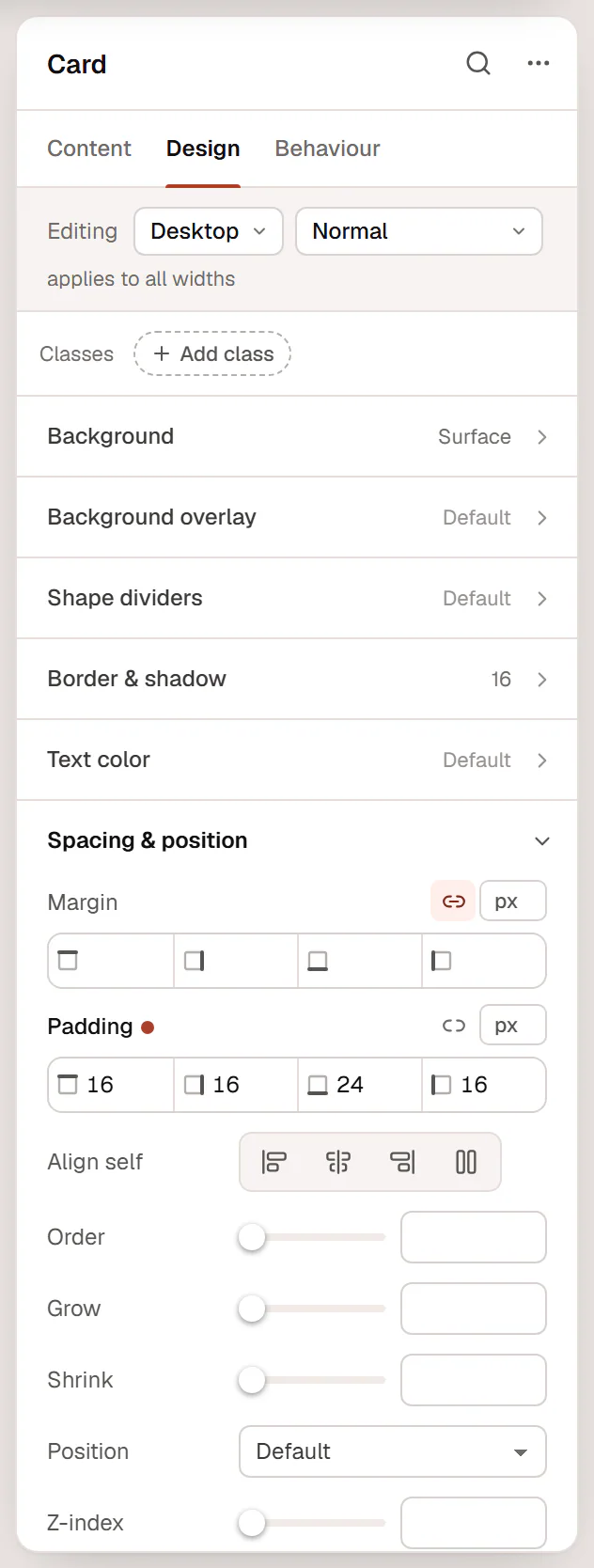
Margin and padding
- Padding is the space inside the element, between its edge (and background) and its content.
- Margin is the space outside the element, between it and its neighbours.
Each has four fields: top, right, bottom and left.
- Click the chain icon to link or unlink the sides. When linked (Linked: one value for every side), typing one value sets all four.
- Pick the unit next to the fields: px, %, em, rem, vw or vh.
- Change a value by typing, with the ↑ and ↓ keys, by scrolling over the field, or by dragging the small side icon.
- Click { } to use a named spacing size from your Design System, so the spacing stays consistent across the site.
Margin can be negative, which pulls an element closer to its neighbour or makes it overlap.
Use the Gap of the parent container for the space between items, rather than margins on each item. It is easier to keep even, and it disappears automatically at the edges. See Containers & flexbox.
Drag spacing on the canvas
With Spacing handles on the canvas turned on in Editor preferences, the selected element shows small handles:
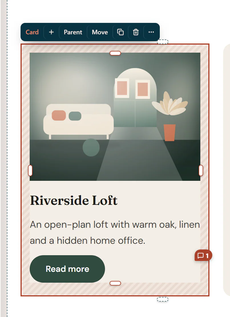
- Drag a padding handle into the box. Hold Shift to change all four sides, or Alt for the opposite side too.
- Drag a margin handle (above or below the element) away from the box.
- Drag the gap handle between the first two items of a flex container.
- Drag the width handle on the right edge of a column in a row. It snaps to ¼, ⅓, ½, ⅔ and ¾; hold Alt for any value.
A label shows the value while you drag. Each drag is one undo step, and the value is saved for the device you are editing.
Width and height
- Widgets have a Width setting in Spacing & position: Default, Full width, Fit content or Custom. With Custom, set Custom width in px, %, vw or rem. It never grows beyond its container.
- Containers set their Width and Min height in Content → Layout. A container's height grows with its content; Min height such as
100vhmakes a full-screen section. - Some widgets have their own size settings in their style section, for example the Image widget's Width, Max width, Height and Aspect ratio, or an icon's size.
For any size you can switch the unit to custom and type a CSS value such as min(600px, 90vw) or clamp(280px, 40vw, 520px).
Inside a flex container
These settings affect how the element sits in its parent container when the parent is a flex row or column:
| Setting | What it does |
|---|---|
| Align self | Overrides the parent's Align items for this element: Start, Center, End or Stretch. |
| Order | Changes the visual order without moving the element in the page. Lower numbers come first; for example, set 1 on an image on Mobile to move it below the text. |
| Grow | 1 lets the element take the remaining free space in the row. |
| Shrink | 0 stops the element from getting smaller than its width when space is tight. |
Position and z-index
| Setting | What it does |
|---|---|
| Position | Default (normal flow), Relative, Absolute (placed relative to the nearest positioned parent), Fixed (placed relative to the browser window) or Sticky. |
| Offsets | With a position set: the distance from the top, right, bottom and left. |
| Z-index | Which element is on top when elements overlap. Higher numbers are on top. |
Offset sides you leave empty count as 0.
For an element that sticks to the top while visitors scroll, use Behaviour → Motion & effects → Sticky instead of the position setting: it adds an offset and a choice of devices. See Motion & effects.
Per device
Margin, padding, width, Align self, Order, Grow, Shrink, Position, Offsets and Z-index can all be set per device. Switch to Tablet or Mobile in the top bar before you change them. See Responsive editing.