Sizes & layout
Spacing, size and radius variables, container width, gutters and section spacing.
On this page
Consistent spacing makes a site look calm and designed. The Design System has two tools for it: Sizes, named values such as "md = 16px" that you pick in any size or spacing field, and Layout, the site-wide container width, side gutter, default gap and section spacing.
Sizes
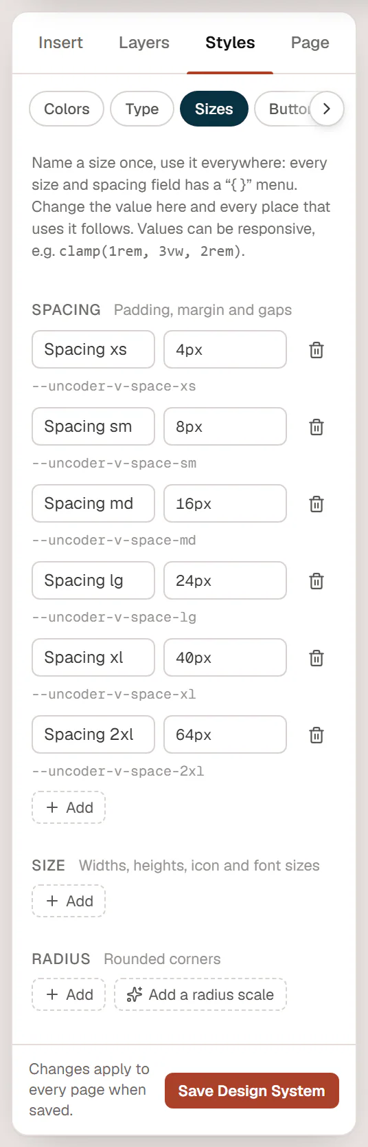
Open Styles → Sizes in the editor. The panel explains: Name a size once, use it everywhere: every size and spacing field has a “{ }” menu. Change the value here and every place that uses it follows.
Sizes come in four groups:
| Group | Use it for |
|---|---|
| Spacing | Padding, margin and gaps. |
| Size | Widths, heights, icon and font sizes. |
| Radius | Rounded corners. |
| Other | Anything else. |
A new site has no sizes yet. To add them:
- Click Add a spacing scale to add six spacing sizes at once, from Spacing xs (4px) through sm, md, lg and xl to Spacing 2xl (64px).
- Click Add a radius scale for four radius sizes: sm (4px), md (8px), lg (16px) and full (9999px, for pill shapes).
- Click Add in any group to add a single size. Give it a name and a value.
Values can be any CSS size, including ones that scale with the screen, such as clamp(1rem, 3vw, 2rem). Click the trash icon to delete a size; there is no confirmation, and fields that used it lose the value.
Click Save Design System to keep your changes.
Use a size in a field
Size and spacing fields in the inspector, such as Gap, Padding or Width, have a { } button (Use a design variable):
- Click { } next to the field.
- Pick a size from the list. The field's own group is listed first, for example the Spacing sizes for a gap.
The field now shows the size's name and follows it: change Spacing md from 16px to 18px in the Design System, and every field that uses it changes too. Click × on the chip (Stop using this variable) to go back to a normal value. Choose Manage variables… at the bottom of the list to open the Sizes tab.
Each size is also a CSS variable, shown next to it, such as --urmi-v-space-md. Your theme's stylesheet or another plugin can use it, for example padding: var(--urmi-v-space-md);.
Layout
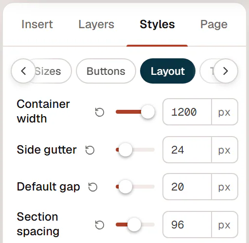
Open Styles → Layout. These values set the grid of the whole site.
| Setting | What it does | Default |
|---|---|---|
| Container width | The maximum width of the content in boxed sections. | 1200 px |
| Side gutter | The space left and right of boxed content, so it never touches the screen edge on small screens. | 24 px (16 px on phones) |
| Default gap | The space between the items inside a container, unless the container sets its own Gap. | 20 px |
| Section spacing | The space above and below each top-level section of a page. | 96 px (72 px on tablets, 56 px on phones) |
- Container width, Side gutter, Default gap and Section spacing can differ per device: switch to Tablet or Mobile in the top bar and change them.
- Section spacing applies to the sections of pages and posts, not to headers, footers, popups, mega menus or loop items. A section with its own top or bottom padding uses that instead.
- The Layout tab also has scroll_offset (16 px): extra space kept above a section when an anchor link scrolls to it, on top of the height of a sticky header.
Sections are boxed or full width with their Content width setting. See Full-width & boxed sections.