Counter
A number that counts up when it scrolls into view, with a label.
The Counter widget shows a key number, such as projects completed or years in business, that counts up when it scrolls into view. Add a prefix or suffix (like $, + or %) and a short label. The final number is always in the page, so search engines and visitors without animation see the real value.
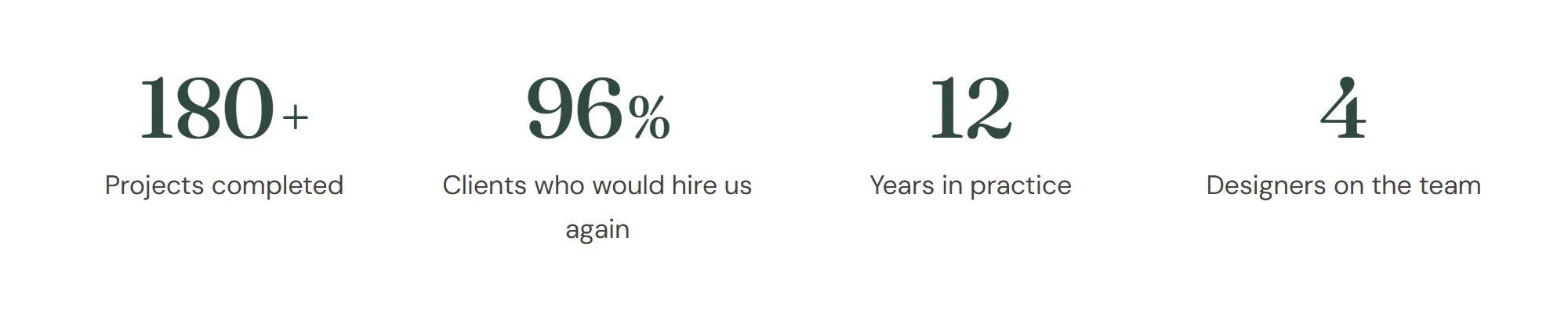
Add a counter
Insert it
Open Insert in the left panel, find Counter under Basic (or type
counterin Search widgets) and click it or drag it onto the canvas.Set the number
Enter the Ending number and, if needed, a Prefix, Suffix and Decimal places.
Write the label
Type the Title, for example “Projects completed”, and choose whether it sits Above or Below the number.
Make a row of stats
Put several counters in a container with Layout → Grid and Columns set to 4 (2 on mobile).
Settings
Settings marked Per device can differ on desktop, tablet and mobile (see Responsive editing).
Content tab
| Setting | What it does |
|---|---|
| Starting number | The number the count starts from. Default: 0. |
| Ending number | The number the count ends on. This final number is in the page HTML, so search engines and visitors without JavaScript see it. Default: 250. |
| Prefix | Text before the number, for example $. |
| Suffix | Text after the number, for example + or %. |
| Decimal places | Number of decimal places. Default: 0. |
| Thousand separator | Groups the digits of large numbers. On by default. |
| Separator | The character that groups the digits. Options: 1,000, 1.000, 1 000, 1'000. Default: 1,000. Shown when Thousand separator is on. |
| Animation duration (ms) | How long the count takes, in milliseconds. The count starts when the counter scrolls into view. Visitors who prefer reduced motion see the final number straight away. Default: 2000. |
| Title | The label under or above the number. Supports dynamic tags. |
| Title HTML tag | The HTML tag of the title. It sets the heading level for search engines and screen readers, not the size. Default: DIV. |
| Title position | Puts the title above or below the number. Options: Above, Below. Default: Below. |
| Alignment | Aligns the counter. Options: Left, Center, Right. Per device. |
Design tab
| Setting | What it does |
|---|---|
| Typography | Text style or font, size, weight and spacing of the number. |
| Color | Color of the number. |
| Text shadow | Shadow behind the number. |
| Prefix & suffix › Size | Size of the prefix and suffix, relative to the number (for example 0.6em). Per device. |
| Prefix & suffix › Color | Color of the prefix and suffix. |
| Prefix & suffix › Weight | Font weight of the prefix and suffix. |
| Prefix & suffix › Vertical position | Vertical position of the prefix and suffix next to the number. Options: Baseline, Middle, Top. |
| Prefix & suffix › Spacing | Space between the number and the prefix or suffix. Per device. |
| Setting | What it does |
|---|---|
| Typography | Text style (from the Design System) or font, size, weight, line height and spacing of the title. |
| Color | Color of the title. |
| Spacing | Space between the number and the title. Per device. |
Every element also has these sections at the end of the Design tab.
| Section | What it does |
|---|---|
| Spacing & position | Margin, padding, width, alignment in its container, order, position (relative, absolute, fixed), offsets, z-index and global classes. See Spacing, size & position. |
| Background & border | Background, border, border radius, box shadow, overflow and opacity of the whole element. See Colors & backgrounds and Borders & shadows. |
| Mask | Crops the element to a shape (circle, arch, blob, star…) or your own SVG or PNG. See Shape dividers & masks. |
Behaviour tab
The Behaviour tab is the same for every element.
| Section | What it does |
|---|---|
| Anchor & classes | An Anchor ID for #links and your own CSS classes. |
| Animations | Entrance, scroll, hover and loop animations from presets or your own timeline. See Motion & effects. |
| Motion & effects | A simple entrance animation, transforms (also on hover), CSS and backdrop filters, and sticky positioning. |
| Scroll & mouse effects | Movement, rotation, scale, fade and blur while the page scrolls, and pointer effects (follow the pointer, 3D tilt). |
| Visibility | Hide the element on desktop, tablet or mobile, or in dark or light mode. See Visibility. |
| Conditions | Show the element only when rules match, such as logged-in visitors, a date range or a URL parameter. See Display conditions. |
| Interactions | Show, hide or change other elements when this one is clicked, hovered or scrolled into view. See Interactions. |
| Attributes | Custom HTML attributes for this element. See Anchor, classes & attributes. |
Tips
- Use real numbers. Visitors trust specific figures (“180+”) more than round ones, as long as they are true.
- Reduced motion. Visitors who prefer reduced motion, and the editor, show the final number without counting.
- Big numbers. Use a Design System text style such as H1 or Display in Design → Number → Typography, and make the suffix smaller with Prefix & suffix → Size (for example 0.6em).
- Label as heading. Keep Title HTML tag on DIV unless the label really is a heading in the page outline.