Nav Menu
A WordPress menu with dropdowns, mega menus and a mobile menu.
On this page
The Nav Menu widget shows one of your WordPress menus, usually as the main navigation in your header. It handles dropdown submenus and mega menus, marks the current page, and turns into a hamburger button with a mobile menu on smaller screens.

Where the menu comes from
The links come from a menu you manage in WordPress, in Appearance → Menus: add pages, posts, categories or custom links there, drag them into order, and nest them to create dropdowns. Choose which menu the widget shows in Menu. When you change the menu in WordPress, every Nav Menu that shows it updates.
To show a full panel of content instead of a simple dropdown, attach a mega menu template to a menu item. See Mega menus.
Add a Nav Menu
Open your header template in the Theme Builder. Then open Insert in the left panel, find Nav Menu in the Site & theme group (or type "menu" in the search box) and drag it into the header. See Add elements.
Set up the mobile menu
On tablets and phones, the menu turns into a hamburger button by default. Choose when with Show hamburger on, and pick how the menu opens with Mobile menu: a Dropdown under the header, an Off-canvas drawer from the side, or Full screen.
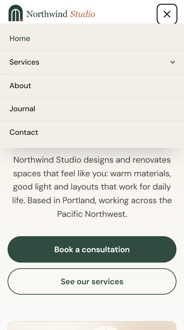
Check it in the Tablet and Mobile views of the editor. See Responsive editing.
Build a one-page menu
If your menu links to sections of the same page (such as #services or #contact), keep Highlight #section links while scrolling on. The link of the section in view is marked as active while the visitor scrolls. Give each section a matching Anchor ID in Behaviour → Anchor & classes.
Content tab settings
| Setting | What it does |
|---|---|
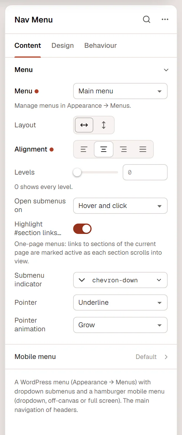
| Menu | Which WordPress menu to show. Empty: the first menu with items. Manage menus in Appearance → Menus. |
| Layout | Horizontal or Vertical. Default: Horizontal. |
| Alignment | Start, Center, End or Stretch. Can differ per device. |
| Levels | How many levels of submenus to show (0–6). 0 shows every level. |
| Open submenus on | Hover and click or Click only. Default: Hover and click. |
| Highlight #section links while scrolling | One-page menus: links to sections of the current page are marked active as each section scrolls into view. On by default. |
| Submenu indicator | The icon next to items with a submenu. Default: a chevron. |
| Pointer | How the hovered and current items are marked: Underline, Overline, Double line, Background or None (color only). Default: Underline. |
| Pointer animation | Grow, Slide, Fade or None. Default: Grow. Not shown for None (color only). |
| Setting | What it does |
|---|---|
| Show hamburger on | Tablet and mobile, Mobile only, All devices or Never. Default: Tablet and mobile. |
| Mobile menu | Dropdown, Off-canvas drawer or Full screen. Default: Dropdown. |
| Drawer side | Left or Right. Default: Right. Shown for Off-canvas drawer. |
| Full-width dropdown | Stretches the dropdown to the width of the screen. On by default. Shown for Dropdown. |
| Toggle icon | The hamburger icon. Default: menu. |
| Close icon | The icon while the menu is open. Default: x. |
| Toggle label | The button's name. Default: Menu. |
| Show label | Shows the label next to the icon. When off, the label is only read by screen readers. |
| Toggle alignment | Start, Center or End. Can differ per device. |
Design tab settings
| Section | Settings |
|---|---|
| Main menu | Typography. Text color and Background on the Normal, Hover and Active tabs (active is the current page and its parent items), with Pointer color on hover and active. Pointer thickness, Item padding, Space between items, Item radius, Indicator size, Indicator spacing. |
| Dropdown | Typography. Text color and Background or Item background on the Normal, Hover and Active tabs. Min width, Distance (space between the menu and its dropdowns), Inner padding, Item padding, Item radius, Divider color, Border radius, Border, Shadow. |
| Hamburger toggle | Icon size, Label typography (when the label is shown), Color and Background (with Normal and Hover tabs), Padding, Border radius, Border. |
| Mobile menu | Typography, Background, Text color (Normal, Hover and Active tabs, with Item background on hover), Item padding, Divider color, Alignment, Distance from toggle (dropdown), Drawer width and Overlay color (drawer), Panel padding, Shadow, Close button color and Close button size (drawer and full screen). |
The Design tab also has the sections every element shares: Spacing & position, Background & border and Mask. See Spacing, size & position.
Behaviour tab
The Behaviour tab has the settings every element shares: anchor and classes, entrance animations, motion effects, visibility per device, display conditions and interactions. See Visibility.
Tips
- The menu works with the keyboard: Tab moves between the links and the submenu arrow buttons, which open with Enter or Space.
- To make the header stay at the top while visitors scroll, set it in the header template's settings. See Headers & footers.
- For a second, smaller menu (such as legal links in the footer), create another menu in Appearance → Menus and add a second Nav Menu.