Widgets overview
All widgets in Urmi, grouped as you find them in the Insert panel.
On this page
Widgets are the pieces you build pages with: headings, text, images, buttons, forms, galleries, maps and more. Urmi has 80 widgets plus the Container, grouped in the Insert panel into seven categories: Layout, Basic, Media, Marketing, Content, Forms and Site & theme. Every widget page below explains what the widget is for, how to add it, and every setting on its Content, Design and Behaviour tabs.
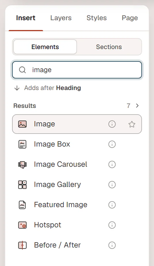
Add a widget
Open the Insert panel
In the editor, click Insert in the left panel and make sure Elements is selected (Sections holds ready-made layouts).
Find the widget
Browse the categories, or type in Search widgets: it matches names and keywords, so
mapfinds Google Maps andfaqfinds Accordion. Use ↑ and ↓ to pick a result.Add it
Click the widget (or press Enter in the search). The line above the list shows where it goes: Adds inside the selected container, Adds after the selected element, or Adds a new section at the end of the page. To place it exactly, drag it onto the canvas instead.
Other ways to add widgets:
- Command palette. Press Ctrl+K (⌘+K on a Mac), type the widget name and choose Insert followed by the name. See Command palette.
- Keyboard. Shift+A opens Insert with the search ready.
- Favourites and Recent. Click the ☆ on a widget row to pin it to Favourites at the top of the list. Widgets you used lately appear under Recent.
- Description. The ⓘ button on a row shows what the widget does.
See Adding elements for sections, patterns and saved sections.
Edit a widget
Click a widget on the canvas (or in Layers) to select it. Its settings open in the inspector on the right, on three tabs:
| Tab | What it holds |
|---|---|
| Content | What the widget shows: text, images, links, items and behaviour options specific to the widget. |
| Design | How it looks: the widget's own style sections, then Spacing & position, Background & border and Mask, which every element has. |
| Behaviour | The same for every element: Anchor & classes, Animations, Motion & effects, Scroll & mouse effects, Visibility, Conditions, Interactions and Attributes. |
Double-click text on the canvas to edit it in place. Many settings can have a different value on tablet and mobile: pick the device in the top bar, then change them (see Responsive editing). Read Editing elements & the inspector for the details.
Turn widgets off
Widgets you never use can be hidden from the Insert panel in Urmi → Settings → Elements, which also shows how often each widget is used. See Element manager.
All widgets
Layout
Containers and nested widgets that hold other elements.
Basic
Everyday building blocks: text, buttons, images, icons and lists.
Media
Images, galleries, video, audio, maps and animations.
Marketing
Pricing, calls to action, testimonials, countdowns and more.
Content
Posts, loops, tables, steps, timelines and navigation aids.
Forms
Contact forms, lead forms and login.
Site & theme
Logo, menus, post parts and archive parts for templates.