Price Table
A pricing plan card with a price, a feature list, a button and an optional badge.
On this page
The Price Table widget is one pricing plan: a title, a price with currency and period, a list of features (included or not), a button and a small note. Place two to four of them side by side to compare plans, and highlight the one you recommend.

Add a Price Table
Open Insert in the left panel and find Price Table in the Marketing group, or type "price" in the search box. Drag it onto the canvas, or click it to add it next to the selected element. See Add elements.
To compare plans, put the tables in a grid container with one column per plan. Build the first card, then duplicate it with Ctrl+D (⌘+D on a Mac) and change the texts. See Grid layouts.
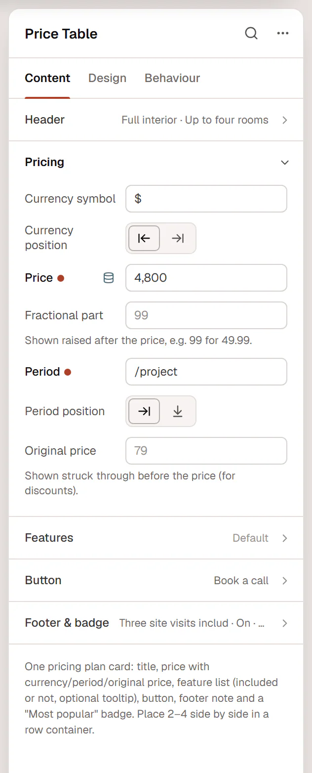
Set the price
Under Pricing, type the number in Price without the currency, such as "49" or "1,299". Put cents in Fractional part: they are shown raised after the price. The Period ("/month", "/project") follows the price, beside it or below it.
To show a discount, type the old price in Original price. It appears struck through before the new one.
List the features
Each row in Features is one line with a check or a cross. Turn Included off for features the plan does not have. Add a Tooltip to explain a feature: visitors see a small info icon and can hover or focus it to read the text. List the features in the same order on every plan, so they line up.
Highlight the recommended plan
Under Footer & badge, turn on Highlight this plan for an accent border and shadow, and type a Badge such as "Most popular". Pick a Badge style: a pill on the top edge, a tag in the corner or a diagonal ribbon. Use Primary as the Style of the highlighted plan's button and Outline on the others.
Content tab settings
| Setting | What it does |
|---|---|
| Icon | An optional icon above the title. |
| Title | The plan name. Supports dynamic data. |
| Subtitle | A short line under the title. Supports dynamic data. |
| Title HTML tag | H1 to H6, DIV, SPAN or P. Default: H3. |
| Setting | What it does |
|---|---|
| Currency symbol | Default: $. |
| Currency position | Before or After the price. Default: Before. |
| Price | The number, without the currency. Supports dynamic data. |
| Fractional part | Shown raised after the price, such as 99 for 49.99. |
| Period | The billing period, such as "/month". Default: /month. |
| Period position | Beside or Below the price. Default: Beside. Shown when there is a period. |
| Original price | Shown struck through before the price, for discounts. |
| Setting | What it does |
|---|---|
| Features | The feature list. |
| Text (each item) | The feature. |
| Included (each item) | On shows the included icon; off shows the not-included icon. On by default. |
| Icon override (each item) | A different icon for this line. Leave it empty to use the included or not-included icon. |
| Tooltip (each item) | A short explanation shown from a small info icon. |
| Icon color (each item) | A color for this line's icon. |
| Included icon | Default: a check. |
| Not included icon | Default: a cross. |
| Strike through features not included | Draws a line through features that are not included. Off by default. |
| Setting | What it does |
|---|---|
| Text | The button label. Leave it empty to hide the button. Supports dynamic data. |
| Link | Where the button goes. Supports dynamic data. |
| Style | Primary, Secondary, Outline, Ghost or Text link, from your Design System. Default: Primary. |
| Size | S, M, L or XL. Default: M. |
| Full width | Stretches the button across the card. On by default. |
| Position | Below the price or After the features. Default: After the features. |
| Setting | What it does |
|---|---|
| Footer note | A small line at the bottom, such as "14-day free trial". |
| Highlight this plan | Accent border and shadow for the recommended plan. Off by default. |
| Badge | A short label such as "Most popular". Leave it empty for no badge. |
| Badge style | Pill on the top edge, Tag in the corner or Diagonal ribbon. Default: Pill. Shown when there is a badge. |
| Badge side | Left or Right. Default: Right. Shown for the corner tag and the ribbon. |
Design tab settings
| Section | Settings |
|---|---|
| Box | Alignment, Background, Padding, Border, Border radius, Shadow (with Normal and Hover tabs; the Hover tab also has Lift, which raises the card), Accent color (highlight border, badge and included icons), Highlighted background (when the plan is highlighted). |
| Header | Icon color, Icon size (when there is an icon), Title typography, Title color, Subtitle typography, Subtitle color, Spacing below. |
| Price | Price typography, Price color, Currency size, Currency & fraction position (Raised or Baseline), Fraction size, Period typography, Period color, Original price typography and Original price color (when there is an original price), Spacing below. |
| Features | Typography, Text color, Included icon color, Not included color, Icon size, Space between rows, List alignment, Dividers between rows and Divider color, Spacing below list. Tooltip: Background, Text color. |
| Button | Typography, Text color, Background and Border color (with Normal and Hover tabs), Border radius, Padding, Spacing below. Shown when there is button text. |
| Footer note | Typography, Color. Shown when there is a note. |
| Badge | Background, Text color, Typography, Border radius (not for the ribbon). Shown when there is a badge. |
The Design tab also has the sections every element shares: Spacing & position, Background & border and Mask. See Spacing, size & position.
Behaviour tab
The Behaviour tab has the settings every element shares: anchor and classes, entrance animations, motion effects, visibility per device, display conditions and interactions. See Motion & effects.
Tips
- Select several price tables at once to change a setting on all of them together, such as the Accent color.
- On phones, set the grid to one column so each plan gets the full width.