Color Scheme Switch
A light and dark mode switch for visitors.
On this page
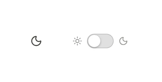
The Color Scheme Switch widget lets visitors switch your site between light and dark mode. It is a small moon or sun button, or a sliding switch, that you usually place in the header. The visitor's choice is remembered on their next visit, and every switch on the page stays in sync.
Before you start: turn on dark mode
The switch only works when your site has a dark mode. In the editor, open Styles in the left panel, go to Colors and set Dark mode to On, with a switch (starts light) or Follow the visitor’s device (with a switch). Then give your colors dark values. See Dark mode.
While dark mode is off, the widget shows a reminder on the canvas ("Dark mode is off…") and nothing on your site.
Add a Color Scheme Switch
Open your header template in the Theme Builder. Then open Insert in the left panel, find Color Scheme Switch in the Site & theme group (or type "dark" or "scheme" in the search box) and drag it next to your menu. See Add elements.
Choose a Style: an Icon button (a moon in light mode, a sun in dark mode) or a Switch with a sun and a moon on either side.
Content tab settings
| Setting | What it does |
|---|---|
| Style | Icon button or Switch. Default: Icon button. |
| Accessible label | The name screen readers announce. Empty: "Dark mode". |
| Alignment | Start, Center or End. Can differ per device. |
Design tab settings
| Section | Settings |
|---|---|
| Switch | Size, Icon color, Background, Switch color when dark (for the Switch style). |
The Design tab also has the sections every element shares: Spacing & position, Background & border and Mask. See Spacing, size & position.
Behaviour tab
The Behaviour tab has the settings every element shares. To show different elements in each mode, such as a light and a dark logo, use Hide in dark mode and Hide in light mode in Behaviour → Visibility. See Visibility.
Tips
- Screen readers announce the switch as a toggle button that is pressed in dark mode.
- Test both modes before you publish: open Styles → Colors and use Preview dark to check every color pair.