Form
Contact and lead forms with any fields, email notifications, integrations and spam protection.
On this page
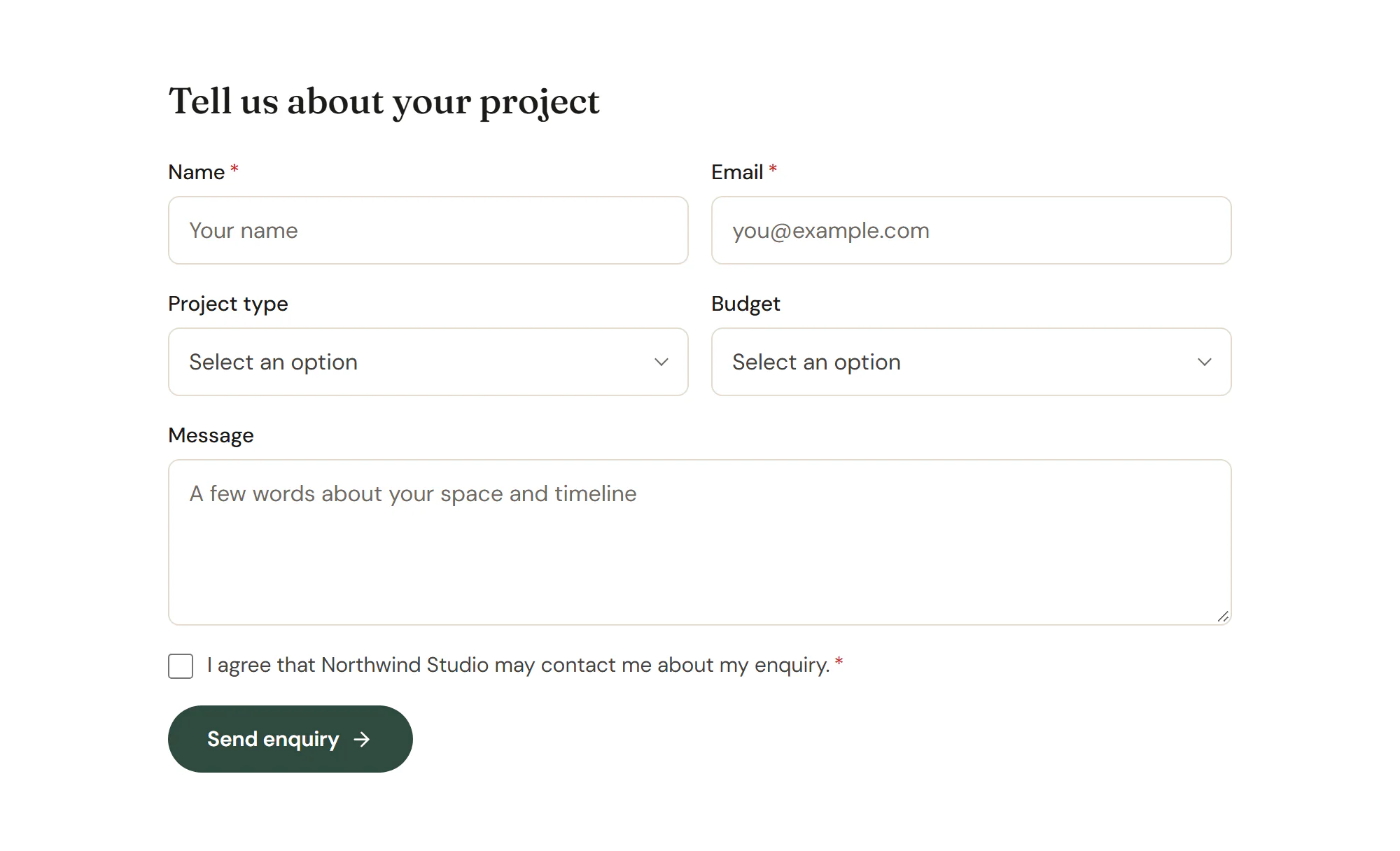
The Form widget adds a form to any page: a contact form, a quote request, a newsletter sign-up or a multi-step questionnaire. You choose the fields, and Urmi checks every submission on the server, saves it under Urmi → Submissions, emails you and, if you like, sends it on to a newsletter service, Slack, Discord or a webhook. Spam protection is built in.
This page is an overview of the widget and all its settings. The Forms section explains each part step by step.
Add a Form
Open Insert in the left panel and find Form in the Forms group, or type "form" in the search box. Drag it onto the canvas, or click it to add it next to the selected element. See Add elements.
A new form has a name, email and message field and sends notifications to the site admin email. Give it a Form name, such as "Contact form": you see this name in the submissions list and in notification emails.
What you can do with a form
Content tab settings
| Setting | What it does |
|---|---|
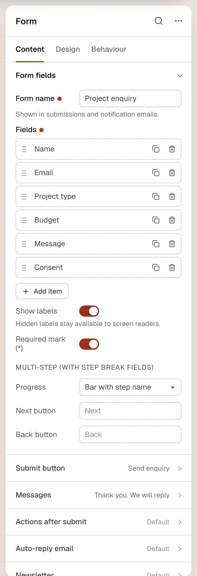
| Form name | Shown in submissions and notification emails. Default: Contact form. |
| Fields | The list of fields. Click Add item to add one; drag the handle to reorder. |
| Type (each field) | Text, Email, Phone, URL, Number, Textarea, Select, Radio buttons, Checkboxes, Acceptance (consent), Date, Hidden, File upload or — Step break — (starts the next step of a multi-step form). Default: Text. |
| Label (each field) | The field's label. |
| Field ID (each field) | Letters, numbers and underscores. Used as [field_id] in emails and as the key in webhooks. Empty: made from the label. |
| Placeholder (each field) | Hint text inside the field. |
| Required (each field) | The form cannot be sent without this field. |
| Options (each field) | For select, radio and checkbox fields: one option per line. Use Label|value to store a different value. |
| Options side by side (each field) | Puts radio and checkbox options in a row. |
| Consent text (each field) | The text next to an acceptance checkbox; links are allowed. Empty: the label. |
| Default value (each field) | A value filled in in advance. For checkboxes, separate several values with commas. |
| Minimum, Maximum (each field) | Limits for number fields. |
| Rows (each field) | The height of a textarea, in lines (2–30). Default: 4. |
| Allowed file types (each field) | Comma-separated extensions for file uploads. Default: pdf,jpg,jpeg,png. Only types WordPress allows are accepted; scripts and SVG never are. |
| Max file size (MB) (each field) | 1–20. Default: 2. |
| Autofill (each field) | Tells browsers what the field is for (name, email, phone, address…), so visitors can fill it in automatically. |
| Help text (each field) | A short hint under the field. |
| Show only if field (each field) | The Field ID of another field. This field stays hidden, and not required, unless the other one matches the Condition (is, is not, contains, is filled in or is empty) and Value. |
| Column width (each field) | 100%, 75%, 66%, 50%, 33% or 25% of the row. Default: 100%. Fields stack full width on phones unless you set a mobile width. |
| Show labels | Shows the field labels. Hidden labels stay available to screen readers. On by default. |
| Required mark (*) | Shows an asterisk after required labels. On by default. |
| Progress | For multi-step forms: Bar with step name, Numbered steps or None. Default: Bar with step name. |
| Next button, Back button | The labels of the step buttons. Default: Next, Back. |
| Setting | What it does |
|---|---|
| Text | The button label. Default: Send message. |
| Icon | An optional icon in the button. |
| Icon position | Before or After the text. Default: After. Shown when there is an icon. |
| Style | Primary, Secondary, Outline or Ghost, from your Design System. Default: Primary. |
| Size | S, M, L or XL. Default: M. |
| Column width | The width of the button's cell. For example, an email field at 66% and the button at 33% make a one-line newsletter form. Can differ per device. |
| Alignment | Left, Center, Right or Full width. Can differ per device. |
| Setting | What it does |
|---|---|
| Success message | Shown after a successful submission. |
| Error message | Shown when the form could not be sent. |
| Required field message | Shown under an empty required field. Default: This field is required. |
| Setting | What it does |
|---|---|
| Save submissions | Keeps each submission under Urmi → Submissions. On by default. |
| Email notification | Emails each submission. On by default. |
| Send to | The addresses to notify, separated by commas. Empty: the site admin email. |
| Subject | Default: New submission: [form_name]. Placeholders: [form_name], [site_name], [field_id]. |
| Reply-to field | The Field ID that holds the visitor's email, so you can answer with Reply. Empty: the first email field. |
| From name | The sender name. Empty: the site title. |
| Email content | All fields or Custom template. Default: All fields. |
| Template | The email body for a custom template. Placeholders: [field_id], [all-fields], [form_name], [page_url], [site_name]. |
| Format | HTML or Plain text. Default: HTML. |
| Redirect after success | An optional page to open after a successful submission. |
| Webhook URL | Optional. Each submission is sent here as JSON (https only). |
| Slack webhook | Optional. Posts each submission to a Slack channel (incoming webhook URL). |
| Discord webhook | Optional. Posts each submission to a Discord channel. |
These settings stay on the server: they are never printed on the page. See Actions after submit.
| Setting | What it does |
|---|---|
| Email the visitor a confirmation | Sends a confirmation to the address the visitor typed. |
| Email field | The Field ID that holds the visitor's email. Empty: the first email field. |
| Subject | Default: Thanks for getting in touch with [site_name]. |
| Message | The email text. Placeholders: [field_id], [all-fields], [form_name], [site_name]. |
| From name | The sender name. Empty: the site title. |
| Reply-to address | Where replies to the confirmation go. |
| Setting | What it does |
|---|---|
| Add to a mailing list | Sends the visitor to a newsletter service. Connect the service in Urmi → Settings → Forms first. |
| Service | Mailchimp, MailerLite, Brevo or ActiveCampaign. Default: Mailchimp. |
| List / group / audience ID | Mailchimp: audience ID. MailerLite: group ID. Brevo and ActiveCampaign: list number. |
| Email field | Empty: the first email field. |
| Name field | The Field ID of the name. |
| Consent checkbox field | Optional. When set, only visitors who tick this field are added. |
| Double opt-in (Mailchimp) | New subscribers confirm by email first. |
See Newsletter sign-ups.
| Setting | What it does |
|---|---|
| Minimum fill time (seconds) | Faster submissions are treated as spam (0–60). Default: 3. 0 turns the check off. |
| Block links in messages | Rejects text and textarea answers that contain links. |
| CAPTCHA | Adds the CAPTCHA set up in Urmi → Settings → Forms. |
| Allow file uploads | File upload fields only work when this is on. Files are stored privately and linked in the notification email. |
A hidden honeypot field, a signed timestamp and a per-visitor limit on submissions are always on. See Spam protection.
Design tab settings
| Section | Settings |
|---|---|
| Form | Column gap, Row gap. |
| Labels | Color, Typography, Space below, Required mark color, Option text color and Option typography (radio and checkbox options), Help text color, Help text typography. |
| Fields | Typography. Text color, Placeholder color, Background, Border and Shadow on the Normal tab; Background and Focus color on the Focus tab. Border radius, Padding, Checkbox & radio color. |
| Button | Typography. Text color, Background, Border and Shadow on the Normal tab; Text color, Background and Border color on the Hover tab. Border radius, Padding. |
| Messages | Typography, Success color, Success background, Error color (also used for field errors and invalid field borders), Error background, Field error typography. |
The Design tab also has the sections every element shares: Spacing & position, Background & border and Mask. See Spacing, size & position.
Behaviour tab
The Behaviour tab has the settings every element shares: anchor and classes, entrance animations, motion effects, visibility per device, display conditions and interactions. See Display conditions.
Tips
- Send a test submission from the published page before you share it, and check that the notification email arrives. If it does not, your site may need an SMTP plugin to send email reliably.
- Ask only for what you need. Every extra field lowers the number of people who finish the form.
- If you collect personal data, add an Acceptance (consent) field that links to your privacy policy. See Privacy.