Borders, radius & shadows
Add borders, round corners and box shadows to elements.
Borders frame an element, rounded corners soften it, and a shadow lifts it off the page. Together they turn a plain container into a card. You find them in the Design tab: in Border & shadow for containers, and in Background & border for widgets.
Add a border
- Select the element and open Design → Border & shadow (containers) or Design → Background & border (widgets).
- Click the Border button to open the border editor.
- Set Style (Solid, Dashed, Dotted, Double or Groove), Width (per side, in px, em or rem) and Color.
A width without a style draws a solid border. To show a line on one side only, for example a divider under a header, unlink the sides and give only the bottom a width.
Containers also have Border color on hover, to highlight a card when the pointer is over it.
Round the corners
Set Radius (containers) or Border radius (widgets). Link the corners for the same value everywhere, or unlink them to round only some corners, for example only the top of a card with an image. Use % for circles and ovals: 50% on a square element makes a circle.
Click { } to use a radius size from your Design System, such as a site-wide card radius. See Sizes & layout.
Rounded corners crop the content inside only when Overflow is set to Hidden (in Background & border). Set it on a card whose image should follow the rounded corners.
Add a shadow
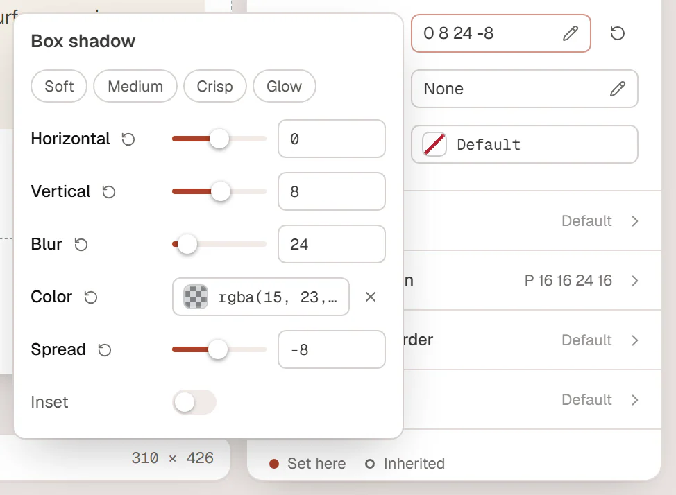
- Click the Box shadow button.
- Start from a preset: Soft, Medium, Crisp or Glow.
- Fine-tune it:
- Horizontal and Vertical: how far the shadow falls to the side and down;
- Blur: how soft its edge is;
- Spread: how much bigger than the element it is;
- Color: usually black or a dark site color at low opacity;
- Inset: draws the shadow inside the element instead.
A shadow shows only once it has a color. Containers also have Box shadow on hover, for cards that lift when the pointer is over them. Add a Transition (ms) in Behaviour → Motion & effects to animate the change.
Text elements have a separate Text shadow in their own style section.
Borders and shadows in other states
To change the border or shadow on hover or focus for any element, switch the state in the Editing row at the top of the Design tab to Hover or Focus and change the settings there. See Hover & other states.