Carousel
A swipeable carousel whose slides can hold any widgets.
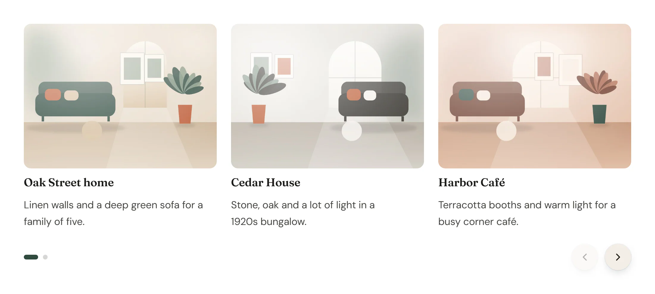
The Carousel shows a row of slides that visitors swipe, drag or page through with arrows. Every slide is a container, so a slide can be a project card, a quote, a team member or any mix of widgets. For a row of plain images use Image Carousel; for a full-width hero slider use Slides.
Add a carousel
Insert it
Open Insert in the left panel, find Carousel under Layout (or type
carouselin Search widgets) and click it or drag it onto the canvas. It starts with three slides.Manage the slides
In Content → Slides, Add item adds a slide; drag the handle to reorder, or use Duplicate item and Delete item. Give each slide a Label so you can find it in Layers.
Build each slide
Drop widgets into the slide containers on the canvas. To bring a slide into view, select it (or anything inside it) in Layers.
Set how many slides show
In Content → Carousel, set Slides per view and Gap. Switch the device in the top bar to show fewer slides on tablet and mobile.
Settings
Settings marked Per device can differ on desktop, tablet and mobile (see Responsive editing).
Content tab
| Setting | What it does |
|---|---|
| Slides | The list of slides. Each slide is a container on the canvas that can hold any widgets. Add item, drag to reorder, Duplicate item and Delete item keep the slides in step. |
| Setting | What it does |
|---|---|
| Label | Name of the slide in this list and in Layers. |
| Setting | What it does |
|---|---|
| Slides per view | How many slides show at once. Decimals such as 1.2 let the next slide peek in. Per device. |
| Slides to scroll | How many slides one arrow click or swipe moves. Per device. |
| Gap | Space between the slides. Per device. |
| Vertical alignment | How slides of different heights line up. Options: Equal height, Top, Middle, Bottom. |
| Navigation › Arrows | Shows previous and next buttons. On by default. |
| Navigation › Arrows position | Where the arrows sit. Options: Inside, over the slides, Outside the slides, Below, next to the pagination. Default: Inside, over the slides. Shown when Arrows is on. |
| Navigation › Previous icon | Icon of the previous button. Shown when Arrows is on. |
| Navigation › Next icon | Icon of the next button. Shown when Arrows is on. |
| Navigation › Pagination | The position indicator under the slides. Options: None, Dots, Fraction (2 / 5), Progress bar. Default: Dots. |
| Navigation › Rewind | Next on the last slide goes back to the first one. |
| Navigation › Mouse drag | Lets visitors drag the slides with the mouse. Touch swipe and trackpads always work. On by default. |
| Navigation › Transition duration (ms) | How long the move to the next slide takes, in milliseconds. Default: 500. |
| Autoplay › Autoplay | Moves to the next slide on its own. Never starts for visitors who prefer reduced motion; pauses while hovered or focused. |
| Autoplay › Delay (ms) | Time each slide stays, in milliseconds. Default: 5000. Shown when Autoplay is on. |
| Autoplay › Pause on hover | Stops autoplay while the pointer is over the carousel. On by default. Shown when Autoplay is on. |
| Autoplay › Pause button | Adds a pause/play button. Required by WCAG 2.2.2 for content that moves on its own. On by default. Shown when Autoplay is on. |
| Autoplay › Accessible name | Name of the carousel for screen readers, for example “Customer stories”. |
Design tab
| Setting | What it does |
|---|---|
| Background | Background of each slide. |
| Border | Border of each slide. |
| Border radius | Rounds the corners of each slide. Per device. |
| Padding | Space inside each slide. Per device. |
| Shadow | Shadow of each slide. |
This section shows when Arrows is on.
| Setting | What it does |
|---|---|
| Button size | Width and height of the arrow buttons. Per device. |
| Icon size | Size of the arrow icons. Per device. |
| Offset | Distance of the arrows from the edge of the slides (inside or outside), or between the two arrows (below). Per device. |
| Normal › Icon color | Color of the arrow icons. |
| Normal › Background | Background color of the arrow buttons. |
| Normal › Border | Border of the arrow buttons. |
| Normal › Shadow | Shadow of the arrow buttons. |
| Hover › Icon color | Color of the arrow icons on hover. |
| Hover › Background | Background color of the arrow buttons on hover. |
| Hover › Border color | Border color of the arrow buttons on hover. |
| Border radius | Rounds the corners of the arrow buttons. Per device. |
This section shows when Pagination is set.
| Setting | What it does |
|---|---|
| Distance from slides | Space between the slides and the pagination. Per device. |
| Alignment | Aligns the pagination. Options: Left, Center, Right. Per device. |
| Dot size | Size of the dots. Shown when Pagination is Dots. |
| Active dot width | Width of the current dot. Same as the dot size for round dots, wider for a pill. Shown when Pagination is Dots. |
| Space between dots | Space between the dots. Shown when Pagination is Dots. |
| Dot color | Color of the dots. Shown when Pagination is Dots. |
| Active dot color | Color of the current dot. Shown when Pagination is Dots. |
| Typography | Text style of the “2 / 5” counter. Shown when Pagination is Fraction (2 / 5). |
| Color | Color of the “2 / 5” counter. Shown when Pagination is Fraction (2 / 5). |
| Bar height | Height of the progress bar. Shown when Pagination is Progress bar. |
| Bar color | Color of the filled part of the progress bar. Shown when Pagination is Progress bar. |
| Track color | Color of the empty part of the progress bar. Shown when Pagination is Progress bar. |
| Pause button color | Color of the pause/play button. Shown when Autoplay is on. |
Every element also has these sections at the end of the Design tab.
| Section | What it does |
|---|---|
| Spacing & position | Margin, padding, width, alignment in its container, order, position (relative, absolute, fixed), offsets, z-index and global classes. See Spacing, size & position. |
| Background & border | Background, border, border radius, box shadow, overflow and opacity of the whole element. See Colors & backgrounds and Borders & shadows. |
| Mask | Crops the element to a shape (circle, arch, blob, star…) or your own SVG or PNG. See Shape dividers & masks. |
Behaviour tab
The Behaviour tab is the same for every element.
| Section | What it does |
|---|---|
| Anchor & classes | An Anchor ID for #links and your own CSS classes. |
| Animations | Entrance, scroll, hover and loop animations from presets or your own timeline. See Motion & effects. |
| Motion & effects | A simple entrance animation, transforms (also on hover), CSS and backdrop filters, and sticky positioning. |
| Scroll & mouse effects | Movement, rotation, scale, fade and blur while the page scrolls, and pointer effects (follow the pointer, 3D tilt). |
| Visibility | Hide the element on desktop, tablet or mobile, or in dark or light mode. See Visibility. |
| Conditions | Show the element only when rules match, such as logged-in visitors, a date range or a URL parameter. See Display conditions. |
| Interactions | Show, hide or change other elements when this one is clicked, hovered or scrolled into view. See Interactions. |
| Attributes | Custom HTML attributes for this element. See Anchor, classes & attributes. |
Tips
- Show a peek. A Slides per view of 1.2 on mobile shows part of the next slide, which tells visitors they can swipe.
- Use autoplay sparingly. Moving content is harder to read. If you turn on Autoplay, keep the Pause button; it is required for accessibility (WCAG 2.2.2). Autoplay never starts for visitors who prefer reduced motion and pauses while the pointer or keyboard focus is on the carousel.
- Name it. Fill in Accessible name (for example “Recent projects”) so screen reader users know what the carousel holds. Keyboard users can move with the arrow keys, Home and End on the carousel's controls.
- Equal heights. Keep Vertical alignment on Equal height for cards, so buttons line up.