Hotspot
An image with markers that open tooltips.
The Hotspot widget places markers on an image. Each marker opens a tooltip with a title, a short text and an optional link. Use it to point out the details of a room, the parts of a product or the stops of a tour. Markers are positioned in percentages, so they stay in place when the image resizes.
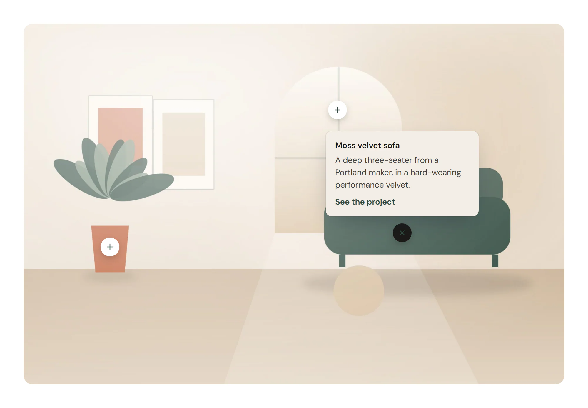
Add hotspots to an image
Insert it
Open Insert in the left panel, find Hotspot under Media (or type
hotspotin Search widgets) and click it or drag it onto the canvas.Choose the image
Pick the Image in Content → Image.
Place the markers
In Content → Hotspots, click a marker and set its Horizontal position and Vertical position in % from the top-left corner. Type its Title and Text, and add a Link if you like. Add item adds another marker.
Choose how tooltips open
Set Open tooltip on to Click / tap or Hover and focus, and pick the default Tooltip position.
Settings
Settings marked Per device can differ on desktop, tablet and mobile (see Responsive editing); marker positions can too, if the image is cropped differently on phones. The image supports dynamic tags (see Dynamic tags).
Content tab
| Setting | What it does |
|---|---|
| Image | The picture the markers sit on. Supports dynamic tags. |
| Resolution | The image size WordPress serves. Smaller files load faster; pick one at least as wide as the image is shown. Default: Large. |
| Setting | What it does |
|---|---|
| Hotspots | The markers. Add item, drag to reorder, Duplicate item and Delete item. |
| Open tooltip on | Opens the tooltips on click or tap, or on hover and keyboard focus. Options: Click / tap, Hover and focus. Default: Click / tap. |
| Tooltip position | Default side of the markers where tooltips open. Options: Top, Bottom, Left, Right. Default: Top. |
| Show title on the marker | Shows the title next to each marker. Otherwise it appears only in the tooltip (screen readers always read it). |
| Pulse animation | Adds a soft pulsing ring around the markers. On by default. |
| Setting | What it does |
|---|---|
| Title | Title of the marker, shown in its tooltip and read by screen readers. |
| Text | Text in the tooltip. |
| Horizontal position | Horizontal position of the marker, in % from the left edge of the image. Default: 50%. Per device. |
| Vertical position | Vertical position of the marker, in % from the top edge of the image. Default: 50%. Per device. |
| Icon | Icon inside the marker. |
| Link | An optional link in the tooltip. |
| Link text | Text of the link in the tooltip. Without text, the marker itself becomes the link. |
| Tooltip position | Side of the marker where this tooltip opens, instead of the default. Options: Default, Top, Bottom, Left, Right. |
Design tab
| Setting | What it does |
|---|---|
| Border radius | Rounds the corners of the image. Per device. |
| CSS filters | Blur, brightness, contrast, saturation and hue of the image. |
| Setting | What it does |
|---|---|
| Size | Size of the markers. Per device. |
| Icon size | Size of the icons in the markers. Per device. |
| Title typography | Text style or font, size, weight and spacing of the marker titles. Shown when Show title on the marker is on. |
| Normal › Icon color | Icon color of the markers. |
| Normal › Background | Background color of the markers. |
| Hover / open › Icon color | Icon color on hover and while the tooltip is open. |
| Hover / open › Background | Background color on hover and while the tooltip is open. |
| Border | Border of the markers. |
| Border radius | Rounds the markers; 50% makes them circles. Per device. |
| Shadow | Shadow of the markers. |
| Pulse color | Color of the pulsing ring. Shown when Pulse animation is on. |
| Setting | What it does |
|---|---|
| Max width | Maximum width of the tooltips. Per device. |
| Distance from marker | Space between a marker and its tooltip. |
| Background | Background color of the tooltips. |
| Padding | Space inside the tooltips. Per device. |
| Border radius | Rounds the corners of the tooltips. Per device. |
| Shadow | Shadow of the tooltips. |
| Title typography | Text style or font, size, weight and spacing of the tooltip title. |
| Title color | Color of the tooltip title. |
| Text typography | Text style or font, size, weight and spacing of the tooltip text. |
| Text color | Color of the tooltip text. |
| Link color | Color of the tooltip link. |
Every element also has these sections at the end of the Design tab.
| Section | What it does |
|---|---|
| Spacing & position | Margin, padding, width, alignment in its container, order, position (relative, absolute, fixed), offsets, z-index and global classes. See Spacing, size & position. |
| Background & border | Background, border, border radius, box shadow, overflow and opacity of the whole element. See Colors & backgrounds and Borders & shadows. |
| Mask | Crops the element to a shape (circle, arch, blob, star…) or your own SVG or PNG. See Shape dividers & masks. |
Behaviour tab
The Behaviour tab is the same for every element.
| Section | What it does |
|---|---|
| Anchor & classes | An Anchor ID for #links and your own CSS classes. |
| Animations | Entrance, scroll, hover and loop animations from presets or your own timeline. See Motion & effects. |
| Motion & effects | A simple entrance animation, transforms (also on hover), CSS and backdrop filters, and sticky positioning. |
| Scroll & mouse effects | Movement, rotation, scale, fade and blur while the page scrolls, and pointer effects (follow the pointer, 3D tilt). |
| Visibility | Hide the element on desktop, tablet or mobile, or in dark or light mode. See Visibility. |
| Conditions | Show the element only when rules match, such as logged-in visitors, a date range or a URL parameter. See Display conditions. |
| Interactions | Show, hide or change other elements when this one is clicked, hovered or scrolled into view. See Interactions. |
| Attributes | Custom HTML attributes for this element. See Anchor, classes & attributes. |
Tips
- Click works everywhere. Click / tap suits touch screens; Hover and focus is handy on desktop, and tooltips still open with the keyboard.
- Accessible markers. Each marker is a button named by its Title, and the Esc key closes an open tooltip. Keep titles meaningful even when Show title on the marker is off.
- Few markers. Three to six markers keep the image readable. Turn off Pulse animation if the markers distract.
- Tooltips near edges. Set a marker's own Tooltip position (for example Left for a marker near the right edge) so its tooltip stays inside the image.