Style book
Preview every color, text style, button and widget with your Design System on one page.
The style book is one long page that shows your whole Design System at work: every color, every text style, the buttons, and every widget with its starting settings. Use it to check a new palette or font before you roll it out, or to spot a widget that does not fit your style.
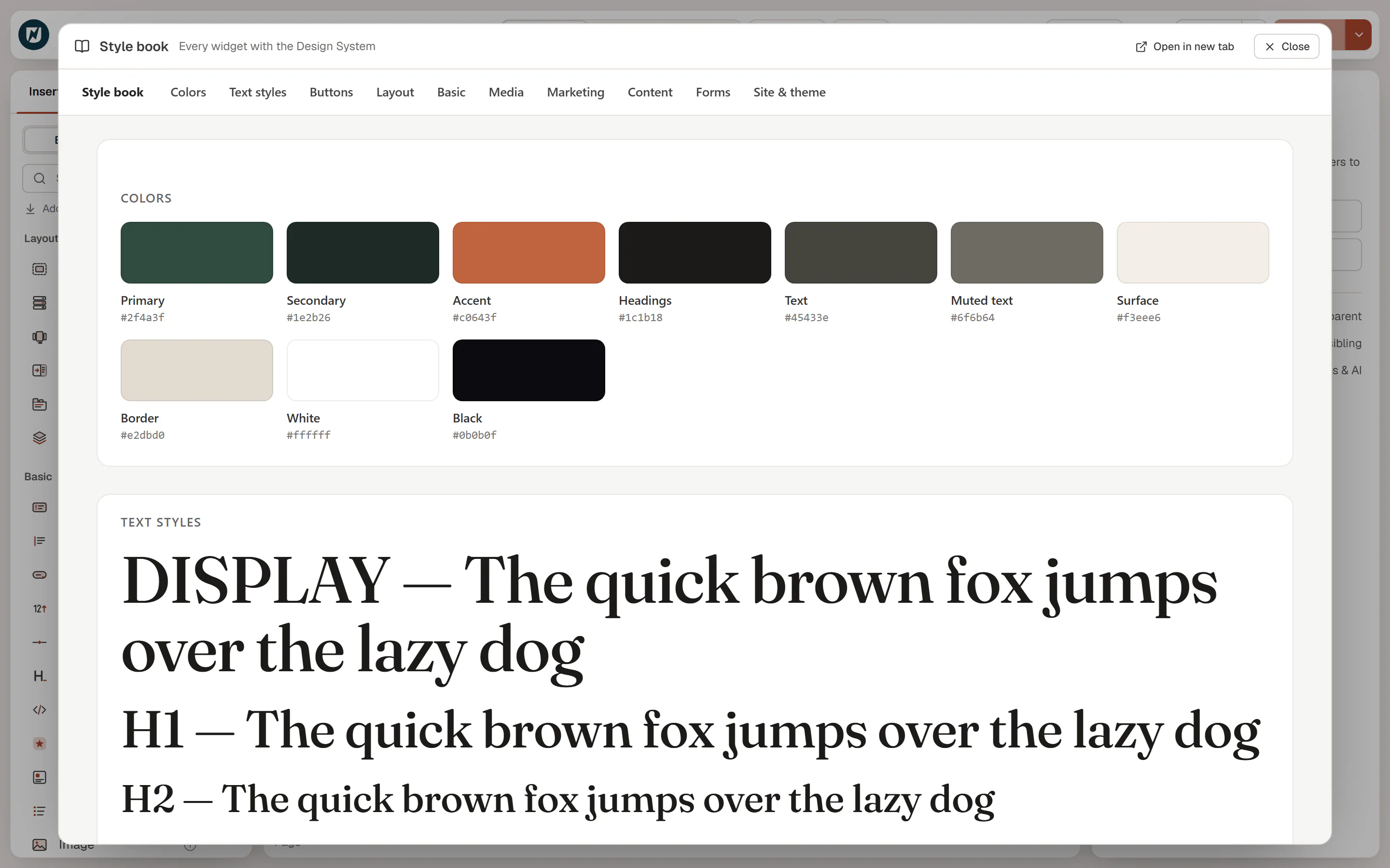
Open the style book
- In the editor: open the Urmi menu in the top-left corner and choose Style book, or press Ctrl+K and choose Style book (all widgets with the Design System).
- From the admin: go to Urmi → Design System → Styles and click Style book. It opens in a new tab.
In the editor, the style book opens over the canvas. Click Close or press Esc to go back, or Open in new tab to open it on its own.
What it shows
A bar at the top links to each part of the page:
- Colors: a swatch for each site color, with its name and value.
- Text styles: each text style as a sample line, from Display and H1 down to Small and Eyebrow.
- Buttons: the Primary, Secondary, Outline and Ghost buttons.
- Layout, Basic, Media, Marketing, Content, Forms, Site & theme: every widget in a labelled card, with the settings it has when you first add it.
The page uses your theme's styles too, so what you see is close to your live site.
Preview Design System changes
When you open the style book from the editor while you change the Design System, it shows your unsaved changes and updates a moment after each edit. The subtitle then reads Showing your unsaved Design System changes. It is the quickest way to see a new color or font on everything at once before you click Save Design System.
Open in new tab and the admin link show the saved Design System.
Who can see it
The style book is for your team: only logged-in users who can edit posts can open it. It is hidden from search engines and never linked from your site.