Grid
Lay out cards and galleries with CSS grid containers, per device.
A grid container places its items in rows and columns of equal width, which is ideal for cards, team members, services, logos and image galleries. Items flow into the next row by themselves, and you choose how many columns each device shows.
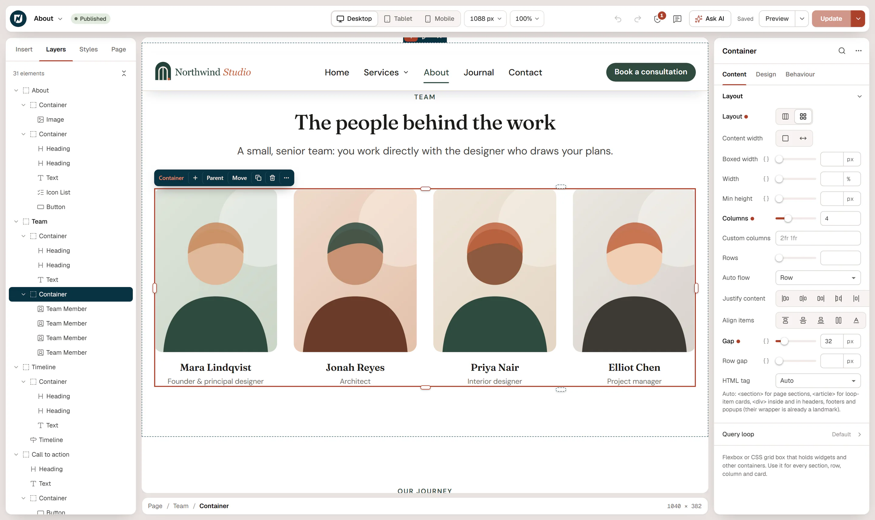
Make a grid
Select the container
Select the container that holds the items, or add a new Container and drop the items into it.
Switch it to grid
In Content → Layout, set Layout to Grid (the icon with four squares).
Choose the columns
Set Columns, for example 3. The items fill the grid from left to right, row by row.
Set the spacing
Set Gap for the space between columns and Row gap for the space between rows (empty: same as the gap).
Grid settings
| Setting | What it does |
|---|---|
| Columns | Number of equal columns, 1 to 12. A new grid has 3. |
| Custom columns | Columns of different widths, written as a CSS grid template, for example 2fr 1fr (two thirds and one third) or 200px 1fr. Use it instead of Columns. |
| Rows | A fixed number of rows (1 to 12). Usually left empty, so rows are added as needed. |
| Auto flow | Row fills row by row (default), Column fills column by column, Dense fills gaps left by larger items. |
| Align items | How items line up vertically in their row: Start, Center, End, Stretch or Baseline. Without a setting, items in a row stretch to the same height. |
| Gap / Row gap | Space between columns and between rows. |
Items in a grid are as wide as their column; their own Width setting is ignored there.
Fewer columns on smaller screens
Grids are the easiest way to make a responsive card layout:
- Set Columns on Desktop, for example 4.
- Switch to Tablet in the top bar and set Columns to 2.
- Switch to Mobile and set Columns to 1 (or 2 for small items such as logos).
You can also change the Gap per device. See Responsive editing.
Grid or flexbox?
| Use a grid when… | Use flexbox when… |
|---|---|
| All items should be the same width, in neat rows. | Items have different widths, such as a logo and a menu. |
| The number of items changes, such as a list of posts. | You want to center or spread a few items. |
| Rows should line up across columns. | Items should wrap onto new lines at their natural width. |
A query loop container set to grid is a quick way to show posts as cards: it repeats one card for each post.