Image Gallery
A grid, masonry or justified gallery with lightbox.
On this page
The Image Gallery shows many images at once, as an even grid, a masonry layout that keeps each image's shape, or justified rows that fill the width edge to edge. Images open in a lightbox, can show captions, and can be sorted into groups with filter buttons for a portfolio.
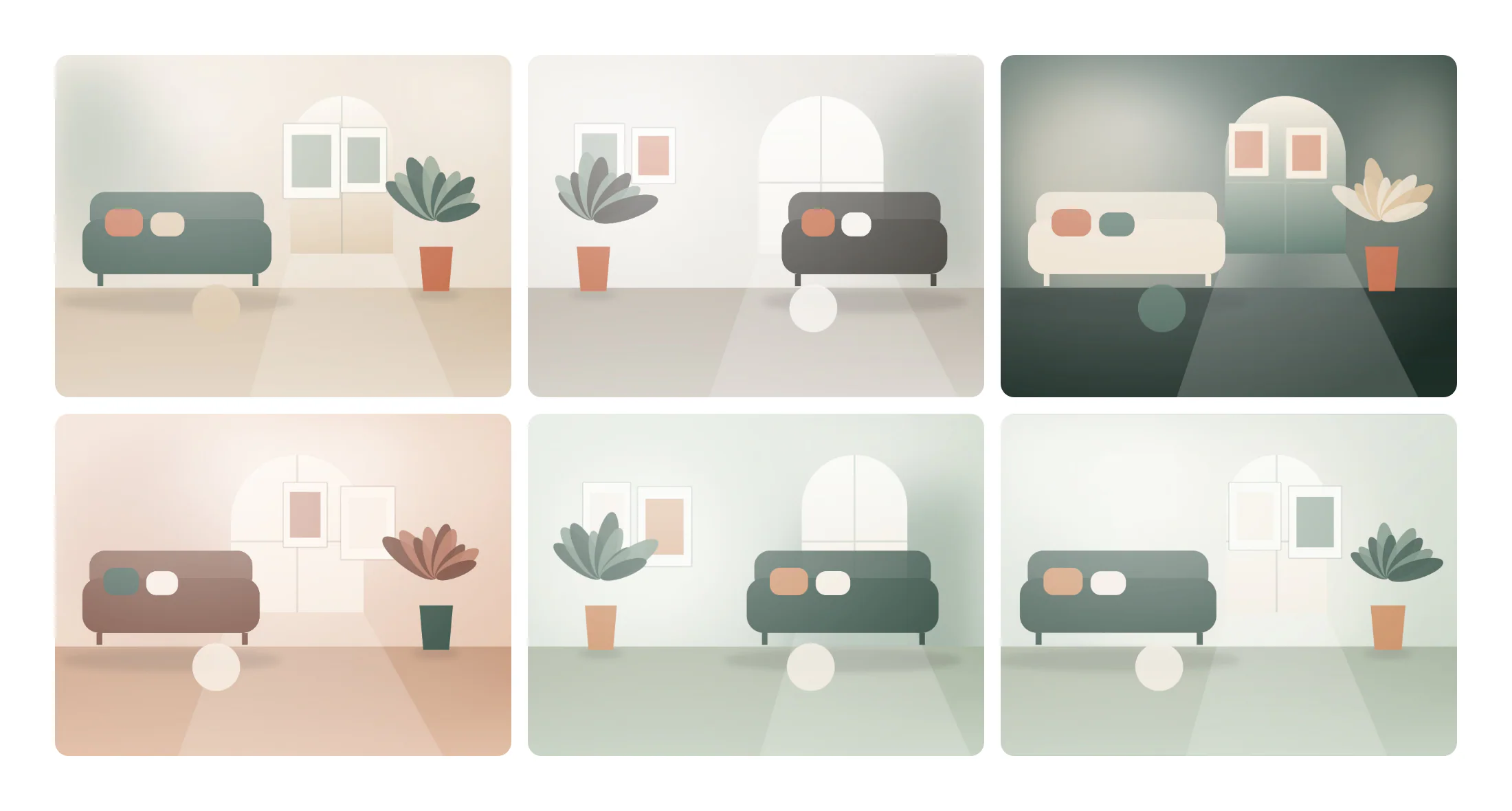
Add a gallery
Insert it
Open Insert in the left panel, find Image Gallery under Media (or type
galleryin Search widgets) and click it or drag it onto the canvas.Choose the images
Click Add images in Content → Gallery and select the images in the media library. Move left and Move right change the order.
Pick a layout
Choose Grid, Masonry or Justified rows in Layout, and set the Columns (or the Row height for justified rows) and Gap.
Captions and lightbox
Choose a Caption source and Caption position, and keep Link on Lightbox so images open large.
Build a filterable portfolio
Turn on Filterable (portfolio). Instead of one list of images you now have Groups: give each group a Group name (such as “Homes” or “Workplaces”) and its own Images. The gallery shows filter buttons above the images, starting with All (rename it in “All” label). Visitors switch groups without the page reloading.
Settings
Settings marked Per device can differ on desktop, tablet and mobile (see Responsive editing).
Content tab
| Setting | What it does |
|---|---|
| Images | The images. Add images opens the media library; Move left and Move right change the order. Shown when Filterable (portfolio) is off. |
| Filterable (portfolio) | Sorts the images into named groups and adds filter buttons above the gallery, for a portfolio. |
| Groups | The groups. Each has a name and its own images. Add item, drag to reorder, Duplicate item and Delete item. Shown when Filterable (portfolio) is on. |
| “All” label | Text of the button that shows every image. Leave empty for “All”. Shown when Filterable (portfolio) is on. |
| Layout | Grid uses equal cells, Masonry keeps each image’s shape in columns, Justified rows fills rows of equal height edge to edge. Options: Grid, Masonry, Justified rows. Default: Grid. |
| Columns | Number of columns in the grid and masonry layouts. Shown when Layout is Grid or Masonry. Per device. |
| Row height | Height of each row in the justified layout. Shown when Layout is Justified rows. Per device. |
| Aspect ratio | Crops every image in the grid to the same shape. Original keeps each image’s own shape. Shown when Layout is Grid. Per device. |
| Gap | Space between the images. Per device. |
| Resolution | The image size WordPress serves. Smaller files load faster; pick one at least as wide as the image is shown. Default: Medium large. |
| Caption | Shows no caption, or the caption, alt text or title from the media library. Options: None, Media library caption, Alt text, Title. |
| Caption position | Puts the caption under the image, over it, or over it only on hover. Justified rows always show captions over the image. Options: Below the image, Over the image, Over the image, on hover. Default: Below the image. Shown when Caption is set. |
| Link | Opens the full image in a lightbox, links to the image file, or no link. Options: None, Lightbox, Image file. Default: Lightbox. |
| Hover overlay | Shows a tinted layer with an icon when the pointer is over a linked image. On by default. Shown when Link is set. |
| Overlay icon | Icon on the hover overlay. Shown when Link is set and Hover overlay is on. |
| Setting | What it does |
|---|---|
| Group name | Name of the group, shown on its filter button. |
| Images | The images of this group. |
Design tab
| Setting | What it does |
|---|---|
| Hover effect | An effect when the pointer is over an image. Dim others fades the other images. Options: None, Zoom, Lift, Grayscale to color, Dim others. Default: Zoom. |
| Border radius | Rounds the corners of the images. Per device. |
| Border | Border of the images. |
| Shadow | Shadow of the images. |
| CSS filters | Blur, brightness, contrast, saturation and hue of the images. |
| Overlay › Overlay color | Color of the hover overlay. Shown when Hover overlay is on. |
| Overlay › Icon color | Color of the overlay icon. Shown when Hover overlay is on. |
| Overlay › Icon size | Size of the overlay icon. Shown when Hover overlay is on. |
This section shows when Caption is set.
| Setting | What it does |
|---|---|
| Typography | Text style or font, size, weight and spacing of the captions. |
| Color | Color of the captions. |
| Background | Background color of the captions. Captions over the image use a dark gradient by default. |
| Alignment | Aligns the captions. Options: Left, Center, Right. Per device. |
| Padding | Space inside the captions. Per device. |
Every element also has these sections at the end of the Design tab.
| Section | What it does |
|---|---|
| Spacing & position | Margin, padding, width, alignment in its container, order, position (relative, absolute, fixed), offsets, z-index and global classes. See Spacing, size & position. |
| Background & border | Background, border, border radius, box shadow, overflow and opacity of the whole element. See Colors & backgrounds and Borders & shadows. |
| Mask | Crops the element to a shape (circle, arch, blob, star…) or your own SVG or PNG. See Shape dividers & masks. |
Behaviour tab
The Behaviour tab is the same for every element.
| Section | What it does |
|---|---|
| Anchor & classes | An Anchor ID for #links and your own CSS classes. |
| Animations | Entrance, scroll, hover and loop animations from presets or your own timeline. See Motion & effects. |
| Motion & effects | A simple entrance animation, transforms (also on hover), CSS and backdrop filters, and sticky positioning. |
| Scroll & mouse effects | Movement, rotation, scale, fade and blur while the page scrolls, and pointer effects (follow the pointer, 3D tilt). |
| Visibility | Hide the element on desktop, tablet or mobile, or in dark or light mode. See Visibility. |
| Conditions | Show the element only when rules match, such as logged-in visitors, a date range or a URL parameter. See Display conditions. |
| Interactions | Show, hide or change other elements when this one is clicked, hovered or scrolled into view. See Interactions. |
| Attributes | Custom HTML attributes for this element. See Anchor, classes & attributes. |
Tips
- Alt text. Each image uses its alt text from the media library; set it there so screen reader users know what each image shows.
- Right resolution. Medium large is usually enough for grid cells; the lightbox always opens the full image.
- Columns on phones. Use 2 columns on mobile, or 1 for large photos.
- Lightbox look. Lightbox colors, captions, counter and download button are set once for the site in Styles → Theme → Lightbox. See Lightbox & site behaviour.