Headers & footers
Build site headers and footers, and make headers sticky, shrinking or transparent.
On this page
A header template replaces your theme's header, and a footer template replaces its footer, on every page where their display conditions match. You can keep one header for the whole site, or add others for some pages, for example a simpler header on landing pages. Headers also have their own behaviour settings: stay visible while scrolling, hide when scrolling down, shrink, change background, or sit transparently over the first section of a page.
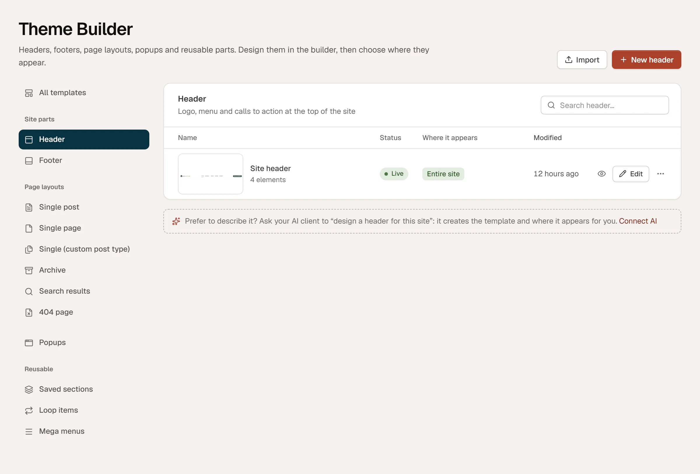
Build a header
Create the template
Go to Urmi → Theme Builder, click New template, choose Header, name it and click Create and open editor. New headers appear on the Entire site once published.
Design it
Add a row container with a Site Logo, a Nav Menu and a Button, for example "Book a consultation". Other useful widgets: Search Form, Language Switcher, Color Scheme Switch, Social Icons. Set the Nav Menu's mobile menu for small screens. See Nav Menu.
Publish
Click Publish. The header replaces the theme's header right away on the pages its conditions match.
Build a footer the same way with the Footer type: columns of links (Icon List or Nav Menu), contact details, social icons and a copyright line. For a year that updates by itself, add the Current date dynamic tag with the format Y.
Urmi places a header template inside a <header> element and a footer inside <footer>, so screen readers and search engines recognise them.
Pages that use the Urmi Canvas (no header/footer) page template show neither the header nor the footer. Use it for landing pages. See Page settings.
Header behaviour
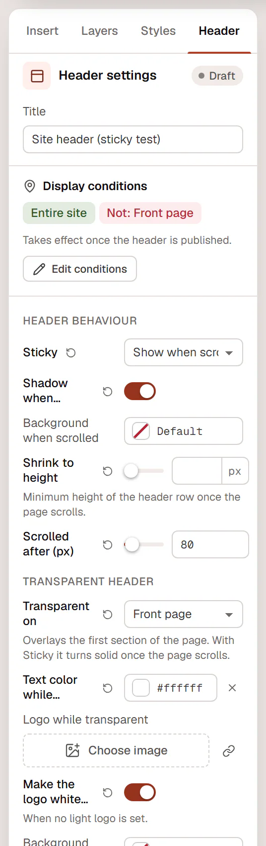
Open the header in the editor and click the Header tab in the left panel (the fourth tab, named after the document). Below Display conditions, the Header behaviour and Transparent header settings control how the header reacts while the visitor scrolls.
Make the header sticky
Choose a Sticky mode:
| Sticky | What happens |
|---|---|
| Off — scrolls away | The header scrolls out of view with the page. |
| Always visible | The header stays at the top of the window. |
| Show when scrolling up | The header hides while the visitor scrolls down and comes back as soon as they scroll up. It saves space on phones. |
A sticky header does not cover the sections you link to: links to #anchors on the same page stop right below it. If a keyboard user tabs to a link inside a hidden header, it comes back into view.
A header whose outer container is set to Sticky: Top in Behaviour → Motion & effects also counts as Always visible.
Shrink and change the header when scrolled
With Sticky on, these settings apply once the page has scrolled:
| Setting | What it does |
|---|---|
| Shadow when scrolled | Adds a soft shadow under the header. On by default. |
| Background when scrolled | A background color for the header row, for example white over a colored first section. |
| Shrink to height | The minimum height of the header row once the page scrolls (40–160 px). Leave it empty to keep the height. |
| Scrolled after (px) | How far the visitor must scroll before the "scrolled" look starts (10 px by default). |
Make the header transparent
A transparent header sits over the first section of the page, for example on a home page with a full-width photo. Set Transparent on:
| Transparent on | Pages |
|---|---|
| Nowhere | The header is never transparent. |
| All pages | Every page where this header appears. |
| Front page | Only the home page. |
| Pages that turn it on | Only pages whose own Transparent header setting is Transparent on this page. |
Then choose how it looks while transparent:
| Setting | What it does |
|---|---|
| Text color while transparent | Color of the menu, the site title and icons over the photo (white by default). Dropdown menus keep their own colors. |
| Logo while transparent | A light version of your logo, shown by the Site Logo widget while the header is transparent. |
| Make the logo white instead | When you have no light logo, turns the normal logo white. |
When the header is also sticky, it turns solid (normal colors and logo, Background when scrolled if set) as soon as the page scrolls. A transparent header that is not sticky scrolls away as it is. When the mobile menu is open, the header turns solid so the menu stays readable.
Each page built with Urmi can override the header's choice in its own settings: in the page's Page tab, set Transparent header to Use the header’s setting, Transparent on this page or Solid on this page. Give the first section of a page with a transparent header enough top padding, so its content is not hidden behind the header.
Use different headers on different pages
Create a second header and give it more specific conditions. For example, keep Site header on the Entire site and add Landing header with Posts, pages & custom types → Pages → your landing pages. The more specific template wins on those pages. See Template conditions.