Colors & backgrounds
Solid colors, gradients, background images, video backgrounds and overlays.
On this page
Containers can have a background color, a gradient, an image, a video or a slideshow of images, with an overlay on top to keep text readable. Widgets have a simpler background in their Background & border section. This page explains the background settings of containers, which you use for sections, columns and cards.
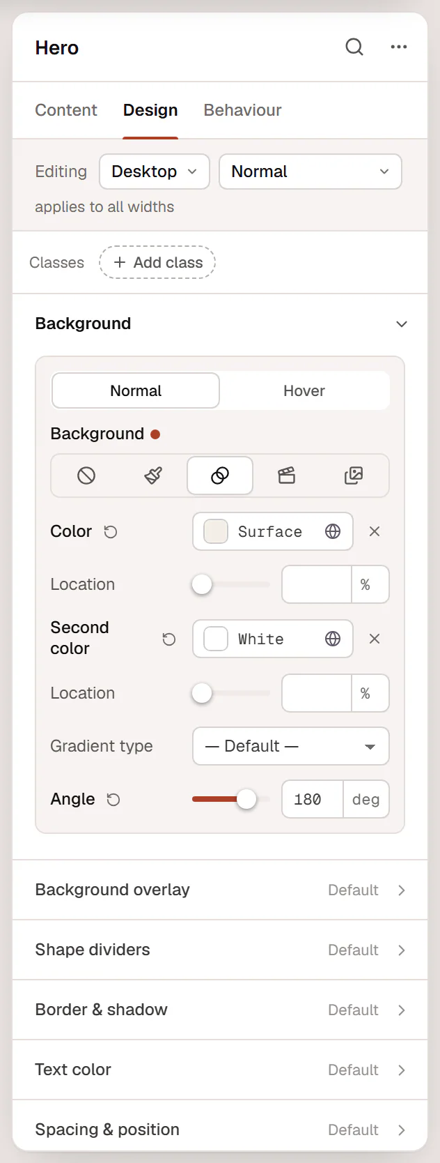
Choose a background type
Select the container, open Design → Background and pick a type:
| Type | Use it for |
|---|---|
| None | No background (transparent). |
| Classic | A solid color, an image, or both. |
| Gradient | A smooth blend between two colors. |
| Video | A muted video that plays in a loop behind the content. |
| Slideshow | Several images that fade or slide one after another. |
The Hover tab next to Normal sets a background for when the pointer is over the container (None, Classic or Gradient), for example on a card.
Color
Choose Classic and set Color. Pick from Site colors so the background follows your palette and dark mode.
Gradient
Choose Gradient and set:
- Color and its Location (where the first color starts, in %);
- Second color and its Location;
- Gradient type: Linear (a straight blend, the default) or Radial (from a point outwards);
- Angle for a linear gradient (180 deg runs from top to bottom), or Position for a radial one.
Image
Choose Classic, then click Choose image under Image. After you pick an image, more settings appear:
| Setting | What it does |
|---|---|
| Position | Which part of the image stays visible, for example Center center or Top center. |
| Size | Cover fills the area (cropping the image if needed), Contain shows the whole image, Auto uses its real size. |
| Repeat | No repeat, Repeat, Repeat X or Repeat Y. |
| Attachment | Fixed keeps the image still while the page scrolls. |
The image, position, size and repeat can differ per device, so you can use a portrait crop on phones.
Motion adds movement to a background image or slideshow on the live site: Parallax, Zoom in on scroll, Zoom out on scroll or Follow the pointer, with Motion speed from 1 to 10. It is off in the editor and for visitors who prefer reduced motion.
Lazy-loaded background images
By default, background images of sections further down the page load only when visitors scroll near them, so the page opens faster. The first section always loads straight away. You can turn this off with Lazy-load background images in Urmi → Settings → General. See Performance.
Video
Choose Video and paste a YouTube, Vimeo or MP4 link into Video, or click the media button to choose a video from your Media Library. Also set:
- Fallback image: shown while an MP4 video loads;
- Color: shown behind the video, and instead of it where it cannot play.
Background videos always play muted, in a loop and without controls. They load only when the section comes near the screen. YouTube videos use the privacy-enhanced (no-cookie) player. Visitors who prefer reduced motion see the color instead of a YouTube or Vimeo video.
A short MP4 file of a few seconds, uploaded to your Media Library, loads fastest and looks best. Keep the text on top readable with an overlay.
Slideshow
Choose Slideshow and click Add images. Then set:
| Setting | What it does |
|---|---|
| Duration | How long each image shows, in milliseconds (5000 = 5 seconds). |
| Transition | Fade or Slide. |
| Speed | How long the transition takes, in milliseconds. |
| Ken Burns | A slow Zoom in or Zoom out on each image. |
| Size, Position | How the images fill the area, as for a single image. |
| Color | Shown before the first image has loaded. |
Only the first image loads with the page; the next one loads just before it is needed. The slideshow pauses when it is off screen. In the editor you see the first image.
Overlay
An overlay is a layer of color or gradient on top of the background and below the content, typically to darken a photo so white text stays readable.
Open Design → Background overlay, choose Classic (a color) or Gradient, and set Opacity from 0 to 1 (for example 0.5).

Text colors on a colored background
Design → Text sets the colors of all text inside the container: Text color (also used for headings), Heading color (when headings should differ), Link color and Link color on hover (text links, not buttons). This is the quickest way to make all text white on a dark section. The same section has Text alignment for everything inside.
Backgrounds on widgets
Widgets have a Background & border section in their Design tab with a background (color, gradient or image), a border, Border radius and Box shadow. Many widgets also have their own background settings, for example the Button's Background in its style section.