Slides
A full-width hero slider with its own content on each slide.
The Slides widget is a hero slider: each slide has its own background image, overlay, heading, description and up to two buttons, and slides change by sliding or fading. It is built for the top of a homepage or a promo area. For slides that hold other widgets, use the Carousel instead.
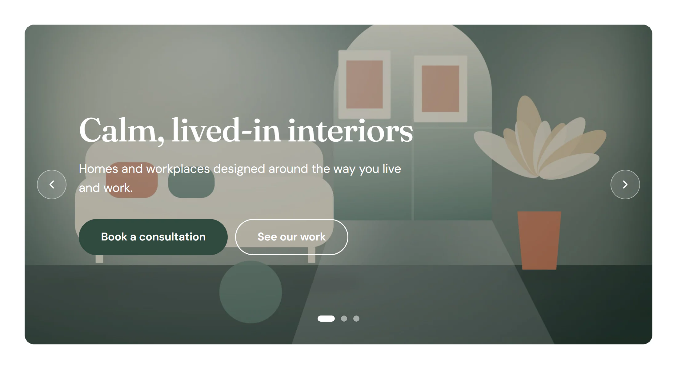
Add a slider
Insert it
Open Insert in the left panel, find Slides under Media (or type
slidesin Search widgets) and click it or drag it onto the canvas. It starts with three slides.Fill each slide
In Content → Slides, click a slide and choose its Background image, type the Heading and Description, and set the Button text and Button link. Add a Second button text for a second button.
Keep the text readable
Give each slide an Overlay color and Overlay opacity, or set one Overlay for all slides on the Design tab.
Set height and behaviour
In Content → Layout, set the Height; in Content → Slider, choose the Transition, arrows, pagination and autoplay.
Settings
Settings marked Per device can differ on desktop, tablet and mobile (see Responsive editing).
Content tab
| Setting | What it does |
|---|---|
| Slides | The slides. Add item, drag to reorder, Duplicate item and Delete item. |
| Setting | What it does |
|---|---|
| Background image | The background photo of the slide. The first slide’s image loads first; the others load when needed. |
| Background color | A color behind the image, or instead of it. |
| Ken Burns effect | A slow zoom on the image while the slide shows. Options: None, Zoom in, Zoom out. |
| Heading | The large title of the slide. |
| Description | A short sentence under the heading. |
| Button text | Text of the main button. Leave empty for no button. |
| Button link | Where the main button goes. |
| Whole slide clickable | Makes the whole slide open the button link. Shown when Button link has a URL. |
| Second button text | Text of a second button. Leave empty for none. |
| Second button link | Where the second button goes. Shown when Second button text is set. |
| This slide › Horizontal position | Horizontal position of this slide’s text, instead of the default. Options: Default, Left, Center, Right. |
| This slide › Vertical position | Vertical position of this slide’s text, instead of the default. Options: Default, Top, Middle, Bottom. |
| This slide › Text alignment | Text alignment on this slide, instead of the default. Options: Default, Left, Center, Right. |
| This slide › Text color | Text color on this slide. |
| This slide › Overlay color | A color over this slide’s image, to keep the text readable. |
| This slide › Overlay opacity | Opacity of that overlay, from 0 to 1. |
| Setting | What it does |
|---|---|
| Height | Minimum height of the slider. A slide whose content needs more room grows, and all slides stay the same height. Per device. |
| Content max width | Maximum width of the text block. Per device. |
| Horizontal position | Horizontal position of the text on every slide. Options: Left, Center, Right. Per device. |
| Vertical position | Vertical position of the text on every slide. Options: Top, Middle, Bottom. Per device. |
| Text alignment | Text alignment on every slide. Options: Left, Center, Right. Per device. |
| Heading HTML tag | The HTML tag of the slide headings. Use H1 only when the slider is the page’s main title. Default: H2. |
| Image resolution | The largest image file offered; browsers pick a smaller one on small screens. Default: Full. |
| First image loading | Auto loads the first image right away, with high priority, when the slider is in the page’s first section. Right away (hero) always does; Lazy never does. Other slides always load lazily. Options: Auto, Right away (hero), Lazy. |
| Setting | What it does |
|---|---|
| Transition | How slides change: sliding or fading. Options: Slide, Fade. Default: Slide. |
| Transition duration (ms) | How long the change takes, in milliseconds. Default: 700. |
| Content animation | An animation of the text when a new slide comes in. Options: None, Fade in, Fade up, Fade down, Zoom in. Default: Fade up. |
| Infinite loop | Next on the last slide shows the first one. On by default. |
| Swipe and drag | Changes slides with a touch swipe or a mouse drag. On by default. |
| Navigation › Arrows | Shows previous and next buttons. On by default. |
| Navigation › Previous icon | Icon of the previous button. Shown when Arrows is on. |
| Navigation › Next icon | Icon of the next button. Shown when Arrows is on. |
| Navigation › Pagination | Dots, a “2 / 5” counter or nothing. Options: None, Dots, Fraction (2 / 5). Default: Dots. |
| Autoplay › Autoplay | Moves to the next slide on its own. It never starts in the editor or for visitors who prefer reduced motion, and it pauses while hovered, focused or off screen. On by default. |
| Autoplay › Delay (ms) | Time each slide stays, in milliseconds. Default: 6000. Shown when Autoplay is on. |
| Autoplay › Pause on hover | Stops autoplay while the pointer is over the slider. On by default. Shown when Autoplay is on. |
| Autoplay › Pause button | Adds a pause/play button. Required by WCAG 2.2.2 for content that moves on its own. On by default. Shown when Autoplay is on. |
| Autoplay › Accessible name | Name of the slider for screen readers, for example “Featured projects”. |
Design tab
| Setting | What it does |
|---|---|
| Background color | Background color of every slide; a slide’s own color wins. |
| Text color | Text color on every slide. |
| Content padding | Space around the text block. Per device. |
| Border radius | Rounds the corners of the slider. Per device. |
| Image focal point | Which part of the images stays visible when they are cropped. |
| Ken Burns zoom | How far the Ken Burns effect zooms, for example 1.15. |
| Image filters | Blur, brightness, contrast, saturation and hue of the images. |
| Setting | What it does |
|---|---|
| Overlay | A color, gradient or image over every slide, to keep the text readable. |
| Opacity | Opacity of the overlay, from 0 to 1. |
| Setting | What it does |
|---|---|
| Typography | Text style or font, size, weight and spacing of the headings. |
| Color | Color of the headings. |
| Spacing below | Space under the headings. Per device. |
| Text shadow | Shadow behind the headings. |
| Setting | What it does |
|---|---|
| Typography | Text style or font, size, weight and spacing of the descriptions. |
| Color | Color of the descriptions. |
| Spacing below | Space under the descriptions. Per device. |
| Setting | What it does |
|---|---|
| Button style | Button style of the main button, from the Design System. Options: Primary, Secondary, Outline, Ghost. Default: Primary. |
| Second button style | Button style of the second button. Options: Primary, Secondary, Outline, Ghost. Default: Outline. |
| Button size | Size of the buttons. Options: S, M, L, XL. Default: L. |
| Gap between buttons | Space between the two buttons. Per device. |
| Typography | Text style or font, size, weight and spacing of the buttons. |
| Border radius | Rounds the corners of the buttons. Per device. |
| Normal › Main button › Text color | Text color of the main button. |
| Normal › Main button › Background | Background color of the main button. |
| Normal › Main button › Border color | Border color of the main button. |
| Hover › Main button › Text color | Text color of the main button on hover. |
| Hover › Main button › Background | Background color of the main button on hover. |
| Hover › Main button › Border color | Border color of the main button on hover. |
| Normal › Second button › Text color | Text color of the second button. |
| Normal › Second button › Background | Background color of the second button. |
| Normal › Second button › Border color | Border color of the second button. |
| Hover › Second button › Text color | Text color of the second button on hover. |
| Hover › Second button › Background | Background color of the second button on hover. |
| Hover › Second button › Border color | Border color of the second button on hover. |
This section shows when Arrows is on.
| Setting | What it does |
|---|---|
| Button size | Width and height of the arrow buttons. Per device. |
| Icon size | Size of the arrow icons. Per device. |
| Distance from edge | Distance of the arrows from the edges of the slider. Per device. |
| Normal › Icon color | Color of the arrow icons. |
| Normal › Background | Background color of the arrow buttons. |
| Normal › Border color | Border color of the arrow buttons. |
| Hover › Icon color | Color of the arrow icons on hover. |
| Hover › Background | Background color of the arrow buttons on hover. |
| Border radius | Rounds the corners of the arrow buttons. Per device. |
| Setting | What it does |
|---|---|
| Distance from bottom | Distance of the dots or counter from the bottom. Per device. |
| Dot size | Size of the dots. Shown when Pagination is Dots. |
| Active dot width | Width of the current dot. Same as the dot size for round dots, wider for a pill. Shown when Pagination is Dots. |
| Space between dots | Space between the dots. Shown when Pagination is Dots. |
| Dot color | Color of the dots. Shown when Pagination is Dots. |
| Active dot color | Color of the current dot. Shown when Pagination is Dots. |
| Typography | Text style of the “2 / 5” counter. Shown when Pagination is Fraction (2 / 5). |
| Color | Color of the “2 / 5” counter. Shown when Pagination is Fraction (2 / 5). |
| Pause button color | Color of the pause/play button. Shown when Autoplay is on. |
Every element also has these sections at the end of the Design tab.
| Section | What it does |
|---|---|
| Spacing & position | Margin, padding, width, alignment in its container, order, position (relative, absolute, fixed), offsets, z-index and global classes. See Spacing, size & position. |
| Background & border | Background, border, border radius, box shadow, overflow and opacity of the whole element. See Colors & backgrounds and Borders & shadows. |
| Mask | Crops the element to a shape (circle, arch, blob, star…) or your own SVG or PNG. See Shape dividers & masks. |
Behaviour tab
The Behaviour tab is the same for every element.
| Section | What it does |
|---|---|
| Anchor & classes | An Anchor ID for #links and your own CSS classes. |
| Animations | Entrance, scroll, hover and loop animations from presets or your own timeline. See Motion & effects. |
| Motion & effects | A simple entrance animation, transforms (also on hover), CSS and backdrop filters, and sticky positioning. |
| Scroll & mouse effects | Movement, rotation, scale, fade and blur while the page scrolls, and pointer effects (follow the pointer, 3D tilt). |
| Visibility | Hide the element on desktop, tablet or mobile, or in dark or light mode. See Visibility. |
| Conditions | Show the element only when rules match, such as logged-in visitors, a date range or a URL parameter. See Display conditions. |
| Interactions | Show, hide or change other elements when this one is clicked, hovered or scrolled into view. See Interactions. |
| Attributes | Custom HTML attributes for this element. See Anchor, classes & attributes. |
Tips
- Fast first slide. The first slide's image is a real responsive image that loads first (with high priority when the slider is in the first section); the other slides load lazily. Leave First image loading on Auto.
- One H1. Set Heading HTML tag to H1 only when the slider is the page's main title, otherwise keep H2.
- Autoplay and accessibility. Autoplay never runs in the editor or for visitors who prefer reduced motion, and it pauses on hover, focus or when the slider is off screen. Keep the Pause button when autoplay is on.
- Few slides. Most visitors see only the first slide. Put your main message there and keep it to three to five slides.
- Keyboard. Visitors can change slides with the arrow keys, Home and End on the slider's controls, and swipe on touch screens.