Post Content
The content of the current post or page, for single post and page templates.
On this page
The Post Content widget shows the main content of the post or page being viewed: its text, headings, images, embeds and shortcodes. It is the heart of every single post and page template: you design everything around it once, and each post fills it with its own content.
Where the content comes from
The widget shows what you write when you edit the post in WordPress, whether you use the block editor or build the post itself with Urmi. Blocks, shortcodes and embeds are rendered as usual. Password-protected posts show the password form instead, and posts split with page breaks get "Pages: 1 2" links at the end.
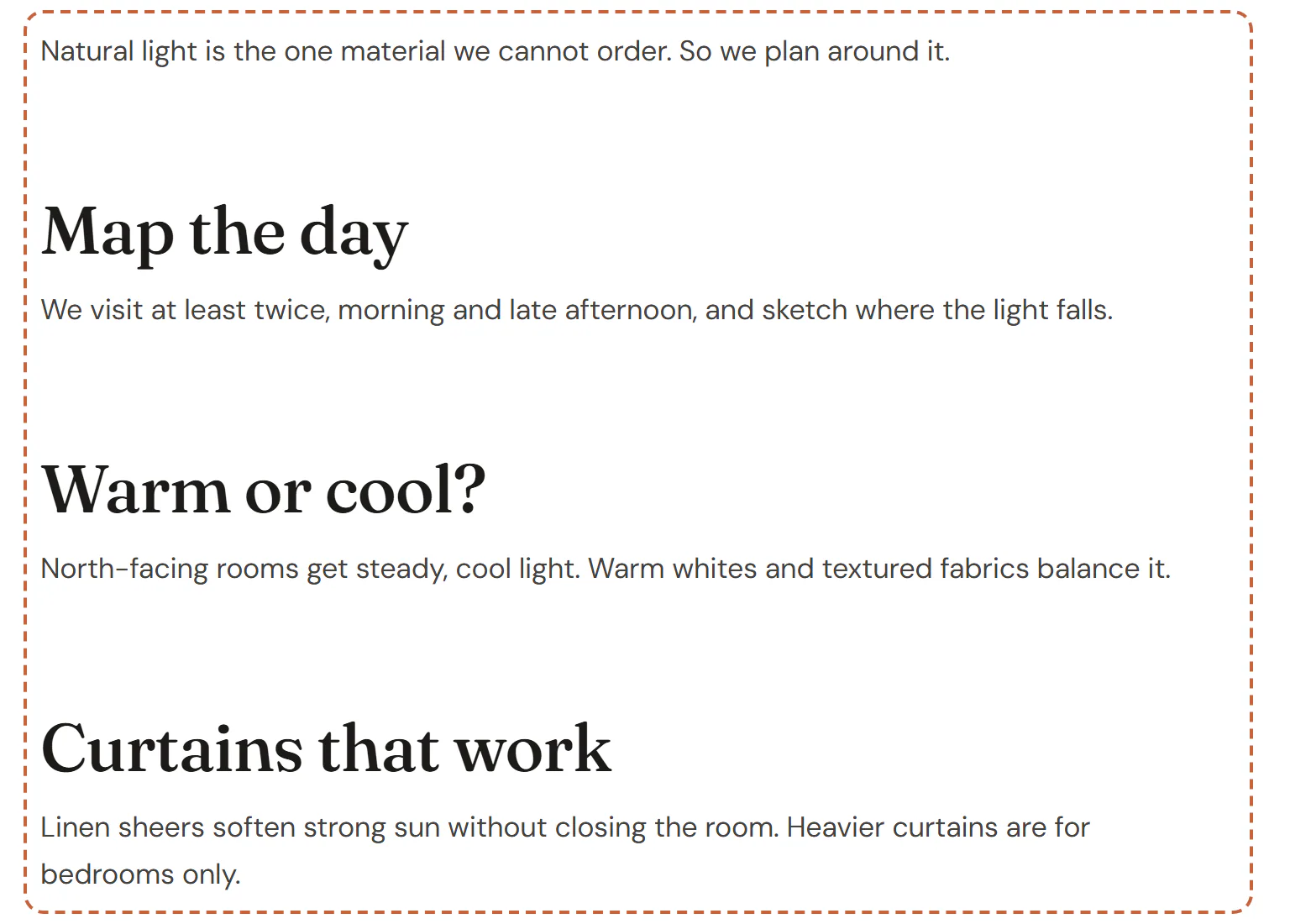
In the editor, the widget shows sample text with headings, a list and a quote, so you can style every kind of content even while you design the template.
Add Post Content
Open your single post or page template in the Theme Builder. Then open Insert in the left panel, find Post Content in the Site & theme group (or type "content" in the search box) and drag it into the template. See Add elements.
Place it once per template. It cannot be used inside the post itself: in a normal page, the widget shows a notice instead.
Style long-form text
Posts written in the block editor do not have Urmi classes on every paragraph and heading. Style them all at once from this widget's Design tab: Text for paragraphs and links, Headings for every heading level inside the content, and Images & quotes for rounded images and the quote accent color. Your Design System text styles apply by default. See Typography.
Content tab settings
| Setting | What it does |
|---|---|
| Alignment | Left, Center, Right or Justify for the text. Can differ per device. |
Design tab settings
| Section | Settings |
|---|---|
| Text | Typography, Text color, Link color, Link hover color, Paragraph spacing. |
| Headings | Typography, Color, Space above headings. |
| Images & quotes | Image radius, Quote accent (the color of the line beside quotes). |
The Design tab also has the sections every element shares: Spacing & position, Background & border and Mask. See Spacing, size & position.
Behaviour tab
The Behaviour tab has the settings every element shares: anchor and classes, entrance animations, motion effects, visibility per device, display conditions and interactions. See Visibility.
Tips
- Keep the content column narrow, around 680–760px, for comfortable reading. Set the width on the container around the widget.
- A Table of Contents with the container selector
.urmi-post-contentlists only the headings of the post.