Container
The layout element that holds everything else: rows, columns, grids and sections.
On this page
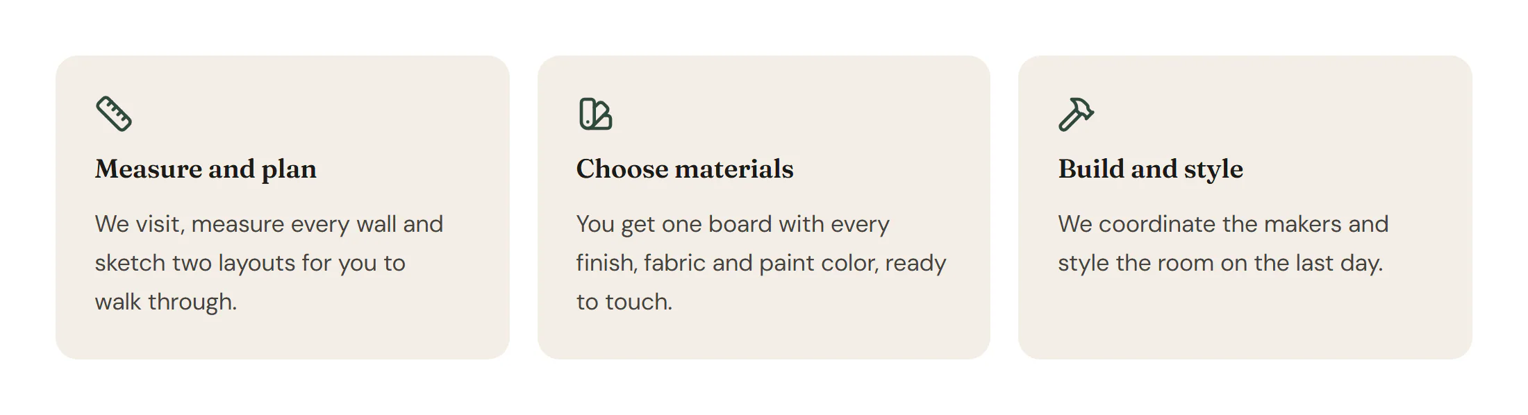
The Container is the building block of every layout. A container at the top level of a page is a section; containers inside it make rows, columns, card grids and cards. It lines up its children with flexbox (a row or a column) or with a CSS grid, and it has its own background, border, shape dividers and query loop.
Add a container
Insert it
Open Insert in the left panel and click Container (the first widget under Layout), or drag it onto the canvas. A line above the widget list tells you where a click adds it, for example Adds inside Container or Adds a new section at the end of the page.
Choose flexbox or grid
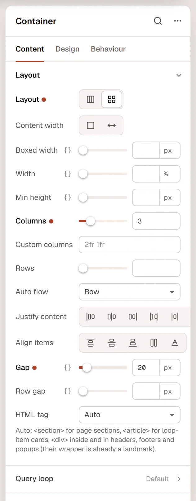
In the inspector, open Content → Layout. Keep Flexbox for a row or a column of elements, or choose Grid and set Columns for a card grid.
Arrange the children
Set Direction, Justify content, Align items and Gap. Switch to Tablet or Mobile in the top bar to set a different direction or column count there, for example Column on mobile.
Style it
On the Design tab, add a background, an overlay, a border, rounded corners or a shape divider.
To wrap elements you already have in a new container, select them and press Ctrl+G (⌘+G on a Mac), or right-click and choose Wrap in container.
Sections, rows and columns
- Sections: top-level containers are sections. They are Boxed by default, so the content stays at the site width from the Design System while the background spans the whole window, and they get the Design System section spacing as top and bottom padding.
- Rows: a container with Direction set to Row. Its children split the space; give a child a Width (for example 40%) to control it.
- Columns and cards: containers inside a row or a grid. Add padding and a background on the Design tab to turn them into cards.
Read Containers & flexbox and Grid for layout recipes, and Full width & boxed for widths.
Repeat a container for each post
Turn on Content → Query loop → Repeat for each item to repeat the container once for every post or term, with dynamic tags inside showing each item. See Query loop containers.
Settings
Settings marked Per device can differ on desktop, tablet and mobile: pick the device in the top bar before you change them (see Responsive editing). Fields that support dynamic tags can show data such as a post title or a custom field (see Dynamic tags).
Content tab
| Setting | What it does |
|---|---|
| Layout | Flexbox lines children up in a row or a column. Grid places them in columns and rows. Default: Flexbox. |
| Content width | Boxed keeps the content at the site width (set in the Design System) inside a full-width background. Full width lets the content use the whole width. |
| Boxed width | Maximum width of the content when the container is boxed. Leave empty for the Design System container width. Shown when Content width is not Full width. Per device. |
| Width | Width of this container inside its parent, for example 50% for one of two columns. Per device. |
| Min height | Minimum height, for example 80vh for a hero. Per device. |
| Direction | Direction of the children: a row (side by side) or a column (stacked). Set Column on mobile to stack a row on phones. Options: Row, Column, Row reversed, Column reversed. Shown when Layout is Flexbox. Per device. |
| Columns | Number of equal columns. Shown when Layout is Grid. Per device. |
| Custom columns | Your own column sizes, for example 2fr 1fr or 240px 1fr. Overrides Columns. Shown when Layout is Grid. Per device. |
| Rows | Number of rows. Leave empty to add rows as needed. Shown when Layout is Grid. Per device. |
| Auto flow | Row fills row by row, Column fills column by column, Dense fills gaps left by larger items. Shown when Layout is Grid. |
| Justify content | Spreads the children along the main direction: start, center, end or with the free space between or around them. Per device. |
| Align items | Lines the children up across the main direction: start, center, end, stretched to the same height or on the text baseline. Per device. |
| Gap | Space between the children. Per device. |
| Row gap | Space between rows, when it should differ from Gap. Per device. |
| Wrap | Wrap moves children to a new line when they do not fit. No wrap keeps them on one line. Shown when Layout is Flexbox. Per device. |
| Align rows | Where the wrapped lines sit when the container is taller than its content: start, center, end or with the free space between them. Shown when Layout is Flexbox and Wrap is Wrap. Per device. |
| HTML tag | The HTML tag of the container. Auto uses <section> for page sections, <article> for loop-item cards and <div> inside other containers and in headers, footers and popups. Choose a (link) to make the whole container a link. |
| Link | Where the container links to when its tag is a (link). Do not put other links or buttons inside a linked container. Shown when HTML tag is a (link). Supports dynamic tags. |
| Setting | What it does |
|---|---|
| Repeat for each item | Repeats this container once for every post or term; dynamic tags inside show that item. Put it inside a grid or row container to lay the copies out. The editor shows the first item. See Query loop containers. |
| Items | Repeat for posts or for terms (categories, tags or other taxonomies). Options: Posts, Terms. Default: Posts. Shown when Repeat for each item is on. |
| Query | Which posts to show: source, post type, number, order, and filters by taxonomy, author or date. Shown when Repeat for each item is on and Items is Posts. |
| Taxonomy | The taxonomy whose terms repeat, such as categories or tags. Shown when Repeat for each item is on and Items is Terms. |
| Which terms | All terms, or only the Terms of this post (on single templates). Default: All terms. Shown when Repeat for each item is on and Items is Terms. |
| Order by | Sort order of the terms. Options: Name, Number of posts, Custom order, Newest. Default: Name. Shown when Repeat for each item is on and Items is Terms. |
| Order | Ascending or descending. Options: Ascending, Descending. Default: Ascending. Shown when Repeat for each item is on and Items is Terms. |
| Number of terms | Maximum number of terms. Default: 12. Shown when Repeat for each item is on and Items is Terms. |
| Hide empty terms | Leaves out terms that have no posts. On by default. Shown when Repeat for each item is on and Items is Terms. |
| When nothing is found | Text shown instead of the container when the query finds nothing. Shown when Repeat for each item is on. |
Design tab
| Setting | What it does |
|---|---|
| Normal › Background | Background of the container: a color, a gradient, an image, a slideshow or a video. |
| Normal › Motion | Moves the background image: parallax, zoom in or out while scrolling, or following the pointer. Options: None, Parallax, Zoom in on scroll, Zoom out on scroll, Follow the pointer. Shown when Background is Classic or Slideshow. |
| Normal › Motion speed | Strength of the background motion, from 1 to 10. Default: 4. Shown when Background is Classic or Slideshow and Motion is set. |
| Hover › Background | Background on hover. |
| Setting | What it does |
|---|---|
| Overlay | A color, gradient or image drawn over the background, for example a dark layer that keeps white text readable on a photo. |
| Opacity | Opacity of the overlay, from 0 to 1. |
| Setting | What it does |
|---|---|
| Top › Shape | A decorative SVG edge at the top of the container. Options: None, Tilt, Layered tilt, Triangle, Triangle (asymmetric), Arrow, Split, Curve, Curve (asymmetric), Book, Wave, Layered waves, Mountains, Zigzag, Pyramids, Clouds. |
| Top › Color | Color of the shape. Use the background of the section next to it for a seamless join. Shown when Shape is set. |
| Top › Width | Width of the shape, from 100% to 300%. Shown when Shape is set. Per device. |
| Top › Height | Height of the shape. Shown when Shape is set. Per device. |
| Top › Flip | Mirrors the shape horizontally. Shown when Shape is set. |
| Top › Invert | Turns the shape upside down. Shown when Shape is Tilt or Triangle or Triangle (asymmetric) or Arrow or Split or Curve or Curve (asymmetric) or Book or Wave or Zigzag or Pyramids or Clouds. |
| Top › Bring to front | Draws the shape above the content instead of behind it. Shown when Shape is set. |
| Bottom › Shape | A decorative SVG edge at the bottom of the container. Options: None, Tilt, Layered tilt, Triangle, Triangle (asymmetric), Arrow, Split, Curve, Curve (asymmetric), Book, Wave, Layered waves, Mountains, Zigzag, Pyramids, Clouds. |
| Bottom › Color | Color of the shape. Use the background of the section next to it for a seamless join. Shown when Shape is set. |
| Bottom › Width | Width of the shape, from 100% to 300%. Shown when Shape is set. Per device. |
| Bottom › Height | Height of the shape. Shown when Shape is set. Per device. |
| Bottom › Flip | Mirrors the shape horizontally. Shown when Shape is set. |
| Bottom › Invert | Turns the shape upside down. Shown when Shape is Tilt or Triangle or Triangle (asymmetric) or Arrow or Split or Curve or Curve (asymmetric) or Book or Wave or Zigzag or Pyramids or Clouds. |
| Bottom › Bring to front | Draws the shape above the content instead of behind it. Shown when Shape is set. |
| Setting | What it does |
|---|---|
| Border | Border style, width and color of the container. |
| Radius | Rounds the corners of the container. Per device. |
| Box shadow | Shadow of the container. |
| Box shadow on hover | Shadow on hover. |
| Border color on hover | Border color on hover. |
| Setting | What it does |
|---|---|
| Text color | Default text color for everything inside, headings included, for example white on a dark section. |
| Heading color | Color of the headings inside, when it should differ from the text color. |
| Link color | Default link color for everything inside. Buttons keep their own colors. |
| Link color on hover | Link color when visitors point at a link. |
| Text alignment | Aligns the text inside: left, center, right or justified. Per device. |
Containers also have these sections at the end of the Design tab.
| Section | What it does |
|---|---|
| Spacing & position | Margin, padding, alignment in the parent, order, grow and shrink, position, offsets, z-index and global classes. See Spacing, size & position. |
| Background & border | Overflow (for example Hidden to clip rounded corners) and Opacity. The background and border themselves are in the container's own sections above. |
| Mask | Crops the container to a shape (circle, arch, blob, star…) or your own SVG or PNG. See Shape dividers & masks. |
Behaviour tab
The Behaviour tab is the same for every element.
| Section | What it does |
|---|---|
| Anchor & classes | An Anchor ID for #links and your own CSS classes. |
| Animations | Entrance, scroll, hover and loop animations from presets or your own timeline. See Motion & effects. |
| Motion & effects | A simple entrance animation, transforms (also on hover), CSS and backdrop filters, and sticky positioning. |
| Scroll & mouse effects | Movement, rotation, scale, fade and blur while the page scrolls, and pointer effects (follow the pointer, 3D tilt). |
| Visibility | Hide the element on desktop, tablet or mobile, or in dark or light mode. See Visibility. |
| Conditions | Show the element only when rules match, such as logged-in visitors, a date range or a URL parameter. See Display conditions. |
| Interactions | Show, hide or change other elements when this one is clicked, hovered or scrolled into view. See Interactions. |
| Attributes | Custom HTML attributes for this element. See Anchor, classes & attributes. |
Tips
- Use gap, not spacers. Gap keeps the space between children even and adapts per device. Use padding for space inside a card.
- Let the tag work for you. HTML tag → Auto already outputs
<section>for sections and<article>for loop cards. Pick header, footer, nav, main or aside when a container has that role, for better accessibility. - Stack rows on phones. Set Direction to Column on mobile, or reduce grid Columns on tablet and mobile.
- Keep text readable on photos. Add a dark Background overlay with an opacity of about 0.5 and set Text color to white in the Text section.
- Reuse styles. Save a card look as a class (Design → Add class) so every card changes together. See Classes.