Icon Box
An icon with a title, text and an optional link, for features and services.
The Icon Box combines an icon (or a small image), a title, a short description and an optional link in one widget. It is the quickest way to build feature lists, service overviews, benefits and contact blocks, usually three or four in a row.
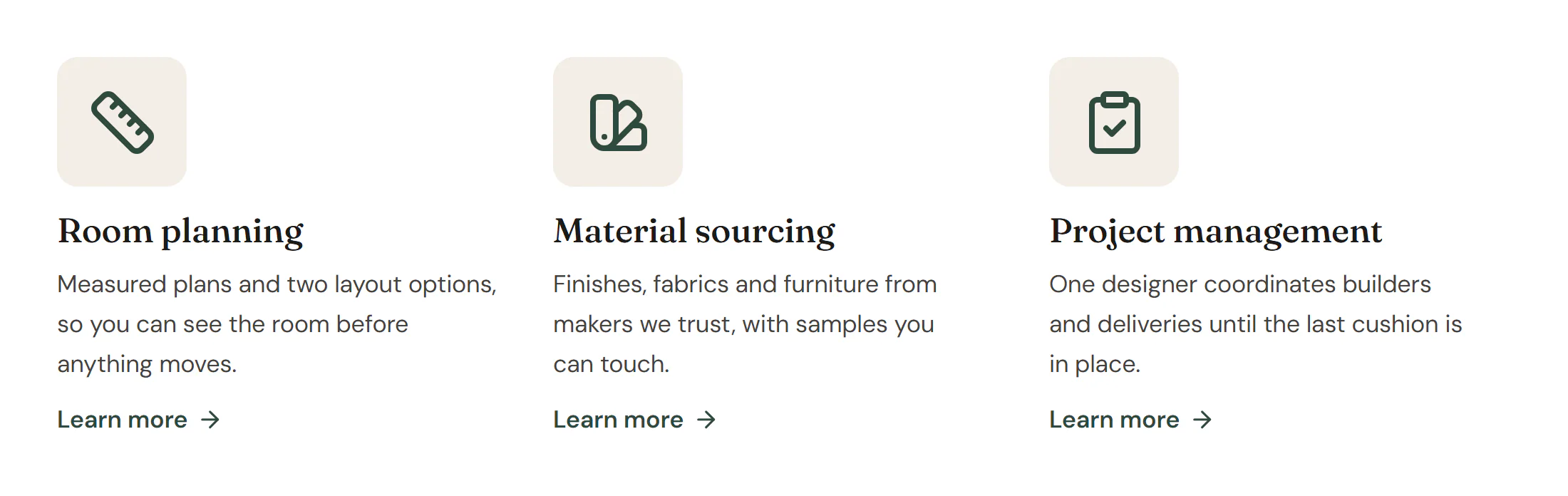
Add an icon box
Insert it
Open Insert in the left panel, find Icon Box under Basic (or type
icon boxin Search widgets) and click it or drag it onto the canvas.Write the content
Type the Title and Description, or double-click them on the canvas to edit in place.
Pick the icon
Choose an Icon and a View (Default, Stacked or Framed). Set Media to Image to use a small picture instead, or None for text only.
Add a link
Fill in Link, then choose the Clickable area and, if you want a visible call to action, a Link text such as “Learn more”.
Settings
Settings marked Per device can differ on desktop, tablet and mobile (see Responsive editing). Fields that support dynamic tags can show data such as a custom field (see Dynamic tags).
Content tab
| Setting | What it does |
|---|---|
| Media | Show an icon, a small image or nothing above the text. Options: Icon, Image, None. Default: Icon. |
| Icon | The icon. Pick one from the icon libraries, or upload an SVG. Shown when Media is Icon. |
| View | Default shows the icon alone, Stacked puts it on a filled shape, Framed inside an outlined shape. Options: Default, Stacked, Framed. Shown when Media is Icon. |
| Shape | The shape behind or around the icon. Options: Circle, Rounded, Square. Default: Circle. Shown when Media is Icon and View is not Default. |
| Image | A small image instead of an icon. Shown when Media is Image. Supports dynamic tags. |
| Resolution | The image size WordPress serves. Smaller files load faster; pick one at least as wide as the image is shown. Default: Thumbnail. Shown when Media is Image. |
| Title | The title of the box. Supports dynamic tags. |
| Description | A short description under the title. Supports dynamic tags. |
| Title HTML tag | The HTML tag of the title. It sets the heading level for search engines and screen readers, not the size. Default: H3. |
| Link | Makes the box a link. Supports dynamic tags. |
| Clickable area | Which part of the box is clickable: the whole box, the icon and title, or only the link text. Options: Whole box, Icon and title, Link text only. Default: Whole box. Shown when Link has a URL. |
| Link text | An optional call to action under the description, such as “Learn more”. Supports dynamic tags. |
| Link icon | Icon after the link text. Shown when Link text is set. |
| Media position | Puts the icon or image above, left or right of the text. Options: Top, Left, Right. Default: Top. Shown when Media is not None. Per device. |
| Vertical alignment | Vertical alignment of the icon or image when it sits left or right of the text. Options: Top, Middle, Bottom. Shown when Media is not None. Per device. |
| Alignment | Aligns the text. Options: Left, Center, Right, Justify. Per device. |
Design tab
| Setting | What it does |
|---|---|
| Padding | Space inside the box. Per device. |
| Border radius | Rounds the corners of the box. Per device. |
| Normal › Background | Background of the box. |
| Normal › Border | Border of the box. |
| Normal › Shadow | Shadow of the box. |
| Hover › Background | Background of the box on hover. |
| Hover › Border color | Border color of the box on hover. |
| Hover › Shadow | Shadow of the box on hover. |
| Hover effect | Moves or shadows the box on hover. Options: None, Lift, Shadow, Lift + shadow. |
| Lift distance | How far the box moves up on hover. Shown when Hover effect is Lift or Lift + shadow. |
| Transition (ms) | Duration of the hover change, in milliseconds. |
This section shows when Media is Icon.
| Setting | What it does |
|---|---|
| Normal › Icon color | Color of the icon. |
| Normal › Shape color | Color of the shape behind or around the icon. Shown when View is not Default. |
| Hover › Icon color | Color of the icon on hover. |
| Hover › Shape color | Color of the shape on hover. Shown when View is not Default. |
| Hover › Hover animation | An animation of the icon when the box is hovered. Options: None, Grow, Float, Rotate. |
| Size | Size of the icon. Per device. |
| Shape padding | Space between the icon and the edge of its shape. Shown when View is not Default. Per device. |
| Frame width | Width of the frame line. Shown when View is Framed. |
| Shape radius | Corner radius of the shape; overrides the Shape setting. Shown when View is not Default. Per device. |
| Stroke width | Line thickness of outline icons. |
| Rotate | Rotates the icon. |
| Spacing | Space between the icon and the text. Per device. |
This section shows when Media is Image.
| Setting | What it does |
|---|---|
| Width | Width of the image. Per device. |
| Aspect ratio | Crops the image to a fixed shape. Per device. |
| Border radius | Rounds the corners of the image. Per device. |
| Border | Border of the image. |
| Shadow | Shadow of the image. |
| Spacing | Space between the image and the text. Per device. |
| Setting | What it does |
|---|---|
| Title › Typography | Text style or font, size, weight and spacing of the title. |
| Title › Color | Color of the title. |
| Title › Hover color | Color of the title when the box is hovered. |
| Title › Spacing | Space between the title and the description. Per device. |
| Description › Typography | Text style or font, size, weight and spacing of the description. |
| Description › Color | Color of the description. |
| Description › Hover color | Color of the description when the box is hovered. |
| Description › Max width | Limits the line length of the description. Per device. |
| Link text › Typography | Text style or font, size, weight and spacing of the link text. Shown when Link text is set. |
| Link text › Color | Color of the link text. Shown when Link text is set. |
| Link text › Hover color | Color of the link text on hover. Shown when Link text is set. |
| Link text › Spacing | Space above the link text. Shown when Link text is set. Per device. |
Every element also has these sections at the end of the Design tab.
| Section | What it does |
|---|---|
| Spacing & position | Margin, padding, width, alignment in its container, order, position (relative, absolute, fixed), offsets, z-index and global classes. See Spacing, size & position. |
| Background & border | Background, border, border radius, box shadow, overflow and opacity of the whole element. See Colors & backgrounds and Borders & shadows. |
| Mask | Crops the element to a shape (circle, arch, blob, star…) or your own SVG or PNG. See Shape dividers & masks. |
Behaviour tab
The Behaviour tab is the same for every element.
| Section | What it does |
|---|---|
| Anchor & classes | An Anchor ID for #links and your own CSS classes. |
| Animations | Entrance, scroll, hover and loop animations from presets or your own timeline. See Motion & effects. |
| Motion & effects | A simple entrance animation, transforms (also on hover), CSS and backdrop filters, and sticky positioning. |
| Scroll & mouse effects | Movement, rotation, scale, fade and blur while the page scrolls, and pointer effects (follow the pointer, 3D tilt). |
| Visibility | Hide the element on desktop, tablet or mobile, or in dark or light mode. See Visibility. |
| Conditions | Show the element only when rules match, such as logged-in visitors, a date range or a URL parameter. See Display conditions. |
| Interactions | Show, hide or change other elements when this one is clicked, hovered or scrolled into view. See Interactions. |
| Attributes | Custom HTML attributes for this element. See Anchor, classes & attributes. |
Tips
- Rows of boxes. Put the icon boxes in a grid container (3 columns, 1 on mobile). Set the icon Media position to Left on tablet for a compact list.
- One link per box. With Clickable area → Whole box, the whole card is one link, which is easier to tap. Don't add other links inside it.
- Heading levels. Keep Title HTML tag on H3 under an H2 section title.
- Hover feedback. Design → Box → Hover effect → Lift + shadow and an icon Hover animation make linked boxes feel clickable.